Remember when you learned to photograph your work against a paper background and get that fade-through-to-black look. So cool, so professional. Then it became easier with a printed graded background that goes from white to grey to black.
Sorry to deliver this news, but that is no longer enough. It’s back to the drawing board. The competition of attention, particularly on the web and in major magazines, demands that your photographs pop. They have to stun, dazzle, intrigue and grab the viewer with ceramic objects that are merely players in a colorful photographic theater.
Although this works for designer ceramics, maybe even studio pottery, you should be careful when it comes to fine art. Here egos are bigger and more territorial; don’t try this unless the collaboration with the photographer is approved and guided by the artist.
I have selected three sources; Torn Boontje, Moooi and Jason Jacques. The first two are Dutch. If you think that country is defined by minimalism, think again, both go for baroque. Jason Jacques, profiled in part II of this post, takes the work of Michael Geertsen and treats us to a virtual acid trip.
Think of these posts next time you launch a product or want press attention.
Garth Clark is the Chief Editor of CFile.
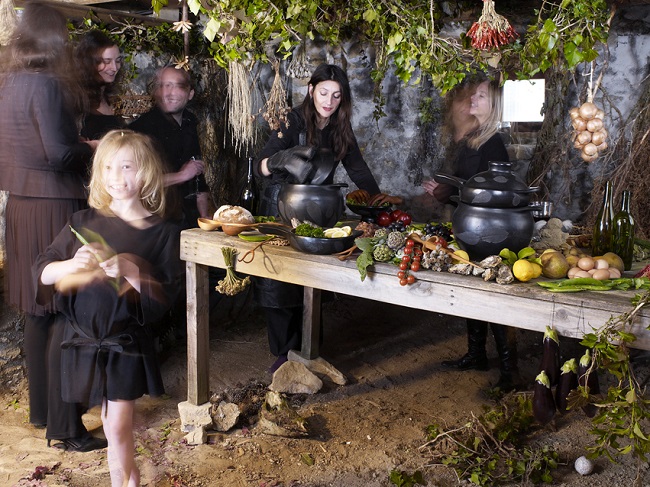
Above image: Photography by Angela Moore for Tord Boontje’s Witches’ Kitchen Line.
Any thoughts about this post? Share yours in the comment box below.


Witches’ Kitchen is a 15-piece handcrafted kitchenware collection designed for Artecnica featuring cookware, utensils and kitchen couture. An Artecnica Design With Conscience project, the collection is a collaborative effort in sustainable design commissioned by Artecnica, designed by Studio Tord Boontje, and made by artisan communities in Brazil, Colombia, and Guatemala.
The ceramic cooking pots have a surface decoration created by pressing leaves from the surrounding jungle into the clay when the artisans are shaping the pots. The leaves burn away in the kiln firing and leave a fossil-like mark.
Here photographer Angela Moore and Tord Boontjes go over the edge with the staging, complete with witches, to sell this mixture of black ware ceramics and wooden utensils.


Tableware for Swedish ceramic company Mateus, launched as part of their 20th anniversary collection. Handmade in Portugal, the floral relief decoration was picked up by the photographer Denise Grünstein and set against a ecstatic bucolic background. My one concern is that the photographs have a slightly funereal quality of tombstone and floral tributes.
“As a designer I have always been interested in creating tableware. I love a meal with friends and family in a nice setting. A special moment which is warm, inviting and informal.” – Tord Boontje.


The Moooi venture, founded in 2001 by Marcel Wanders and Casper Vissers, is named after their native Dutch word for beautiful – the third ‘o’ in the brand name stands for an extra value in terms of beauty and uniqueness. The core strengths of both men continue to complement each other perfectly; Marcel, the obstinate, passionate designer with a nose for business, and Casper, the driven marketeer with a keen eye for design.
Both have a passion for contemporary photography and so that has become part of their look on fair stands and in their showrooms, featuring young talents like Levi van Velum. Their major ongoing collaboration is with one of the Netherlands’ leading photographers, Erwin Olaf, who is responsible for the beautiful riffs above on Dutch baroque painting featuring the ceramic designs of Wanders.


Read Part II of CFile’s Coverage of Art and Design Photography

Add your valued opinion to this post.