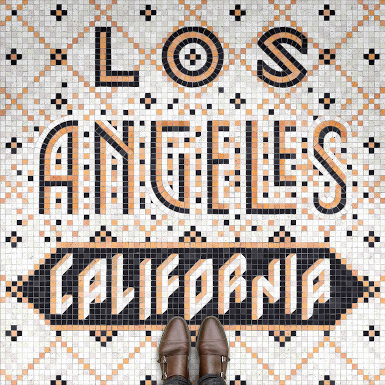
NEW YORK — New York-based designer and letterer Nicholas Misani is fascinated by the fugal convergence of traditional and contemporary forms, which explains why his digital typographical mosaic illustrations aptly called ‘Fauxsaics’ look so much like their ceramic counterparts.
Misani tells DesignBoom he’s always been fascinated with letterings and decorative art, and his hyper realistic digital typographic mosaics reflect that ardor. Each design, he says, commemorates his travels around the world.
Letterforms and color palettes are influenced by each location, drawing from the patterns and motifs found in different cities and communities. San Diego, for example, is patterned with a tableau of pale pink, palm-like trees, reminiscent of a hazy Californian sunset. London follows an orderly grid of black and white squares, while Santo Domingo takes on a fanned formation of red and grey.
His ‘Fauxsaics’ were even featured this week on the front of New York’s Village Voice Newspaper. Super cool, right? You can follow him in his travels on his Instagram. We at Cfile look forward to a Santa Fe ‘Fauxsaic’ soon — we have bubble tea.
Do like these fauxsaics from the worlds of contemporary ceramic design and contemporary ceramics? Let us know in the comments.


Add your valued opinion to this post.