NEW YORK—The Metropolitan Museum promised a highly anticipated major retrospective exhibition of Lucio Fontana, Lucio Fontana: On the Threshold, at their soon to be vacated Met Breuer satellite (January 23 through April 14, 2019), curated by Iria Candela and Estrellita B. Brodsky, Curator of Latin American Art in The Met’s Department of Modern and Contemporary Art. Did the show deliver?
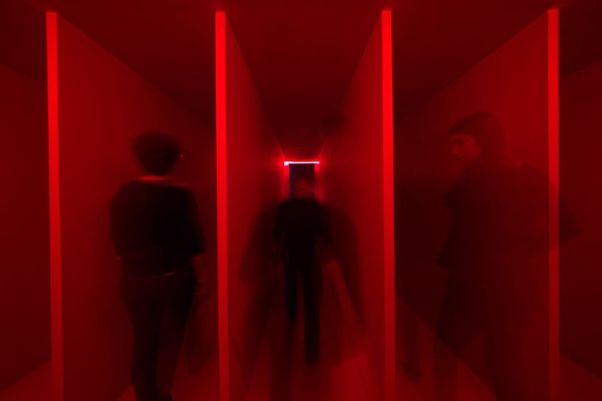
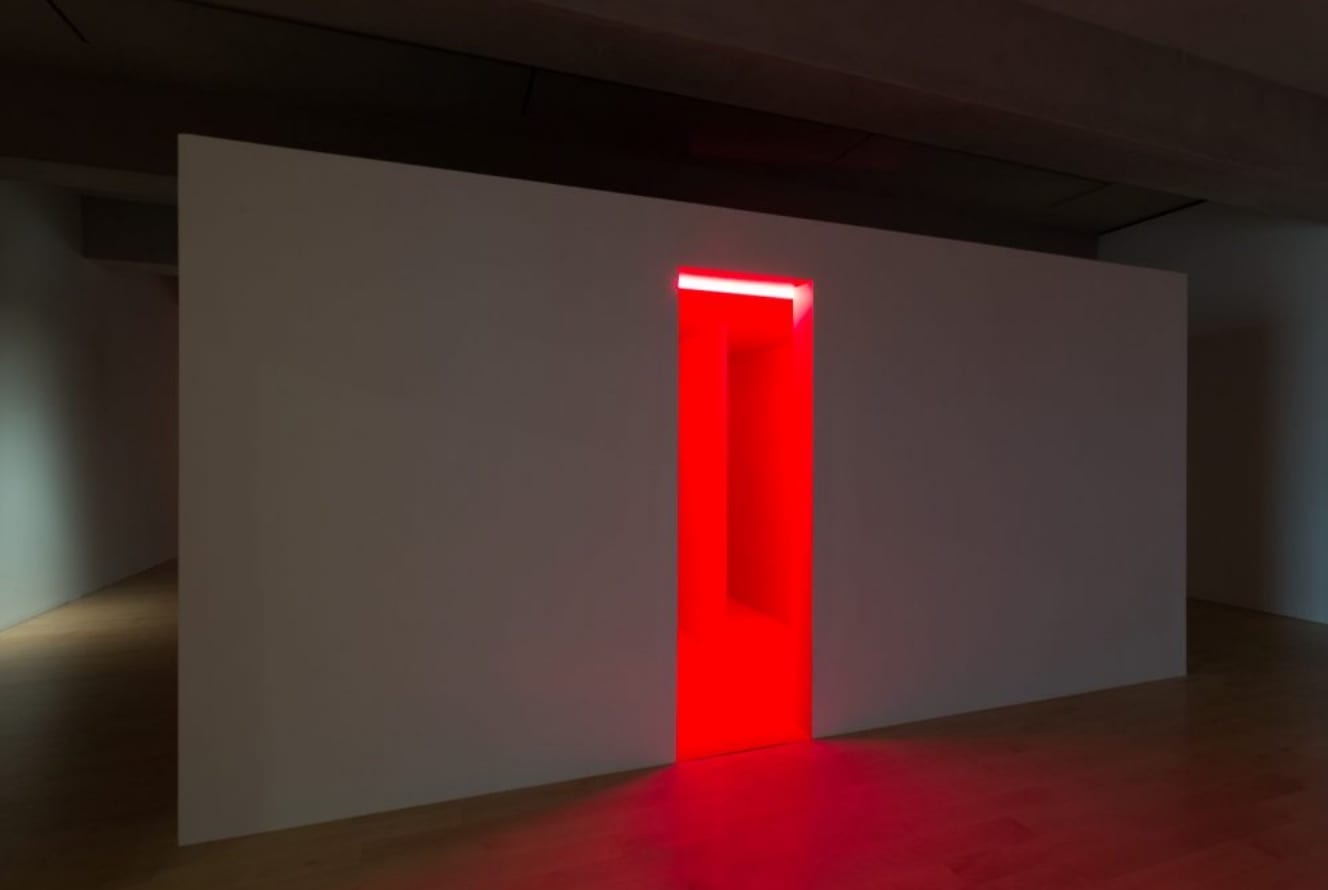
For American audiences, to see any survey of work by this artist is a rare treat. So, in a purely literal sense, yes, they delivered. We got to see a lot of work. On another level, excitement, empathy for the artist, imaginative installation, not so much.
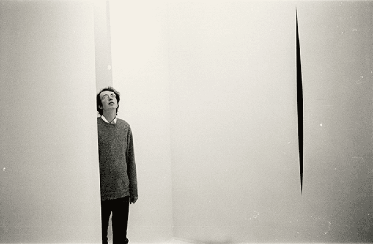
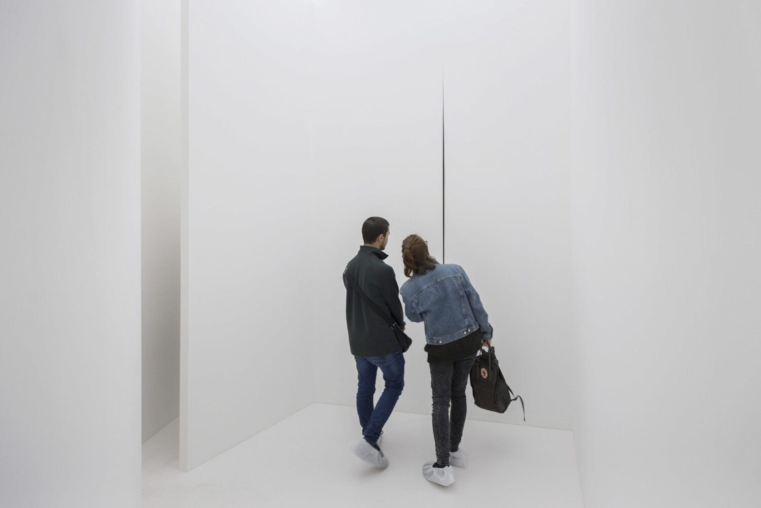
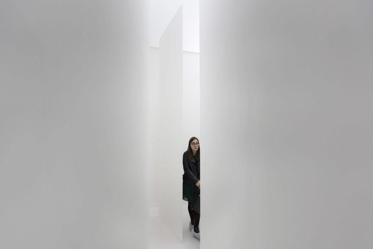
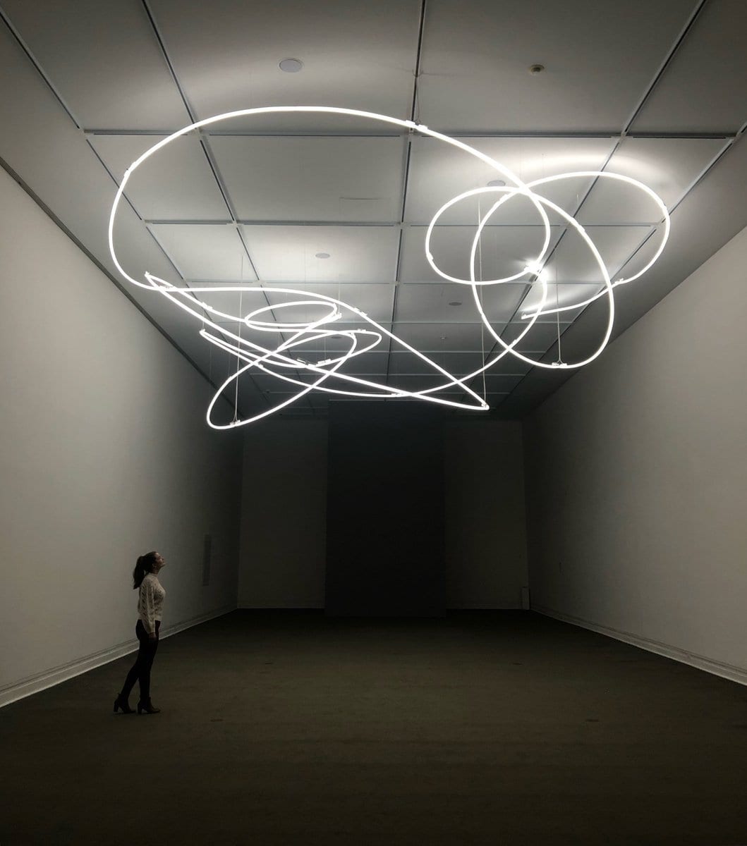
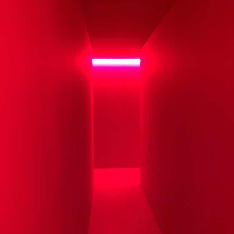
One steps out of the elevator in the 5th floor and is met by Spatial Environment in Red Light (Ambiente Spaziale a Luce Rossa), 1967/2019; carnal, sumptuous and dizzying in its Cardinal scarlet. Lucio (which means light) was pioneer in light sculpture beginning in 1948 with his Spatial Environment in Black Light.
Excited and ready to be challenged one moves downstairs (and downhill) to main exhibition on the third show. It is underwhelming, which with an artist like Fontana seems impossible. Cotter writes in his New York Times review,“Lucio Fontana made abstraction dangerous”. But in this curiously bland curatorial exercise and risk-free installation, one never feels that threat.
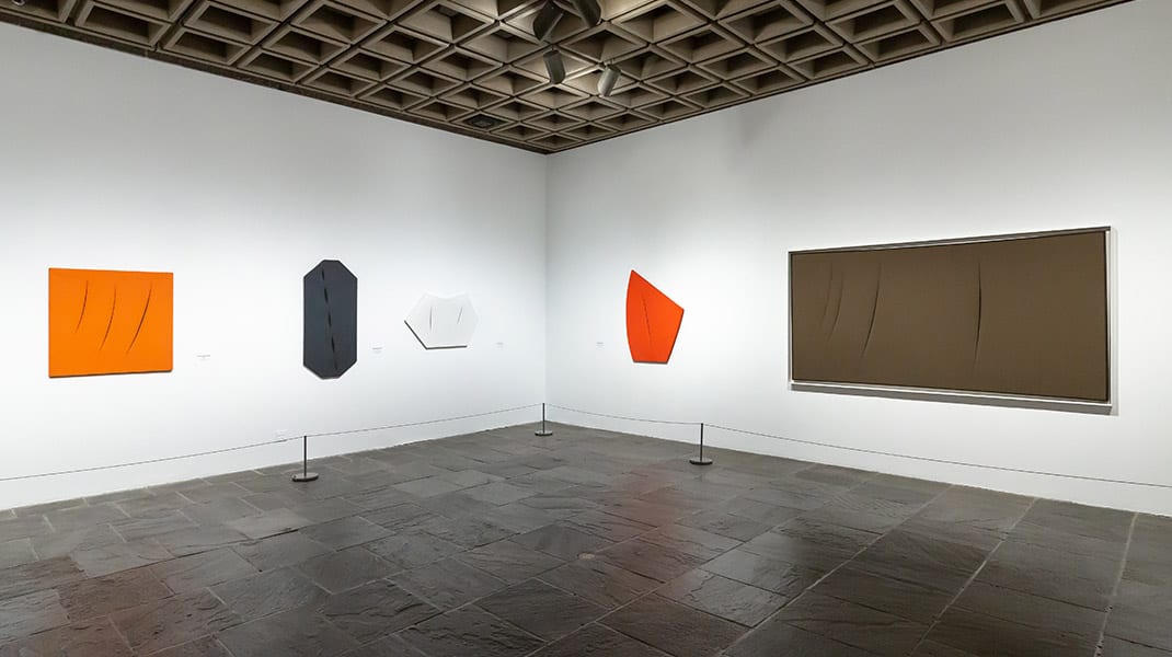
An antiseptic white-box and empty spaces would have served the detachment of Ellsworth Kelly, but neuters the heated, erotic theater of Fontana. Clusters of violent paintings close together, colors clashing and knives slashing would have better communicated the artist’s passion. The many paintings in brown, olive green, tan and a group of somewhat scruffy white canvasses did not reveal an exciting colorist.
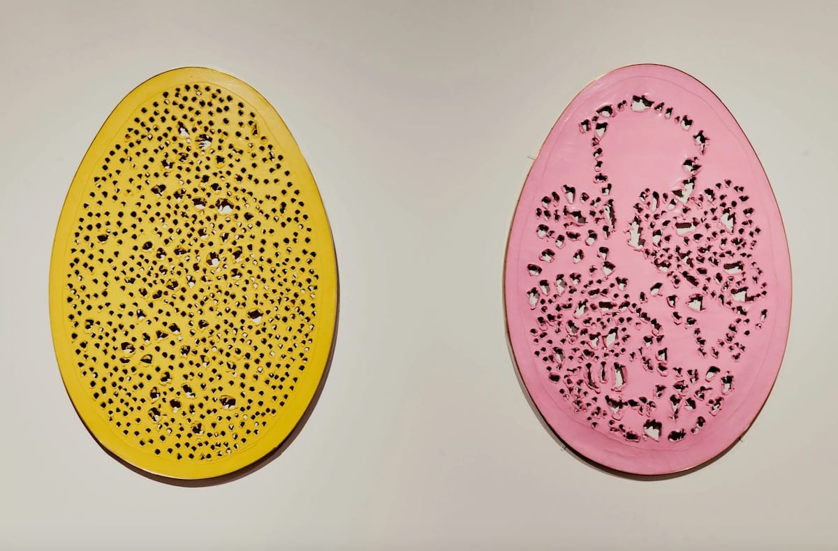
A few paintings almost make the visit worthwhile with the best being the frenzied pair of Buchi (Holes), Spatial Concept, The End of God,” 1964 and Spatial Concept, The End of God, 1963. Cotter described them as “Paintings in sculptural form resemble giant Easter eggs blasted by shotguns”. The key words in that comment are “in sculptural form”.
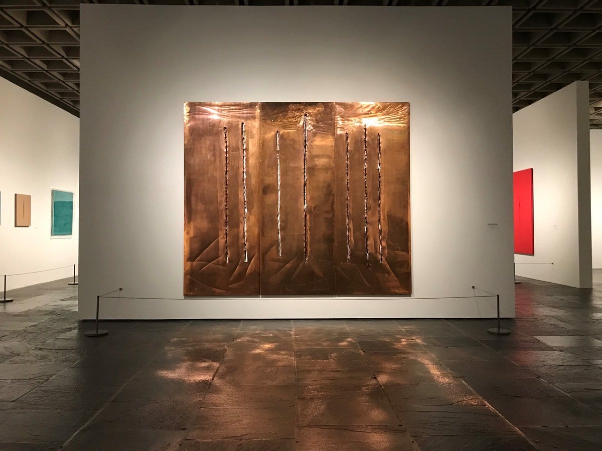
The showy Spatial Concept, New York 10, Concetto spaziale, New York 10 (1962), copper with slashes and scratches, is literally dazzling and its polished surface throws a golden reflection on the gallery floor. This series was inspired by the high-rise canyons of New York City and the way light reflected from the buildings’ glass sheaths. Positioned opposite each other the in an open square space, a pair of Buchi paintings and metal Tagli, are in a standoff, holes vs cuts, fragile canvas against durable metal, painting vs sculptures and for both, a tussle with light. This was for me the third floor’s single moment of magic.
Enough about flat art, my focus is his ceramics. When Mark Del Vecchio and I ran our gallery we held the first survey exhibition of ceramics in the US and launched an interest in this work that quickly priced us out of this market. My book on Fontana’s ceramics will be published (Italy willing) in 2021. Given that were my expectations too high? No, not for the Met. It is sad to see a major exhibition like this, from a major institution, fall so short.
What went wrong at the Met Breuer? Well, just about everything. The quality of the ceramics ranges from poor to great, with the focus on the former. I do not convinced that the curators really knew the difference. After all its just ceramics, what is there to know? And then again, the installation.
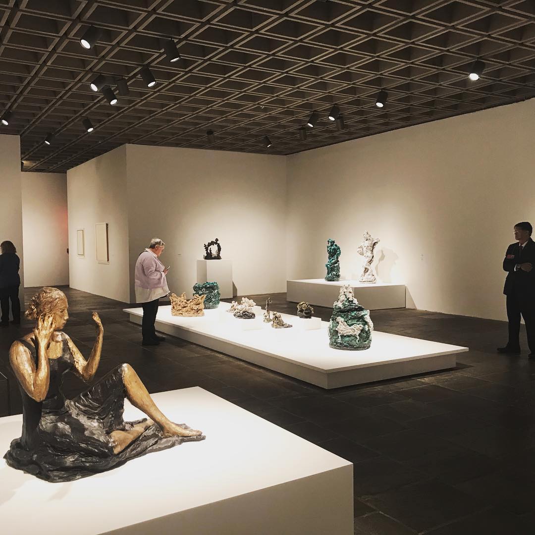
For decades museums have believed that ceramophiles have eyes somewhere around mid-calf and have shown ceramics in clusters on low platforms. The Met it seems, still subscribes to this fiction. This means that we are looking down at the tops of objects. This deforms their shape and, most importantly, denies us their linear anchor, silhouette.
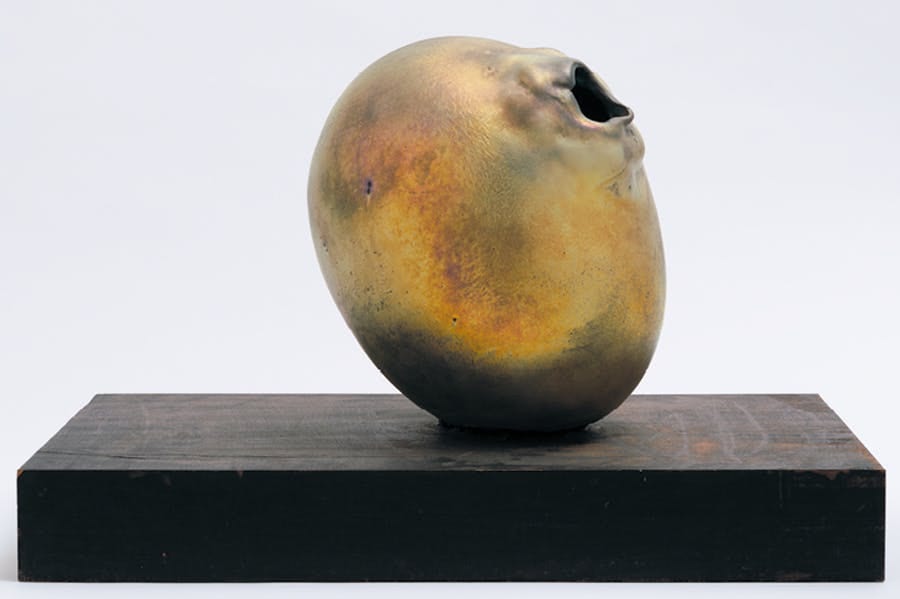
This sculpture for instance Concetto Spaziale, (1962/65) is captured perfectly in this photograph. The outline begins with a flat plane, curves up a fecund orb, then to the greedily pouting hole. It’s languid, sexual and provocative and with the iridescent luster surface, decadent. You can only read this at near eye level. And lighting the work better when it is singularized, near the floor the lustrous grandeur was barely visible.
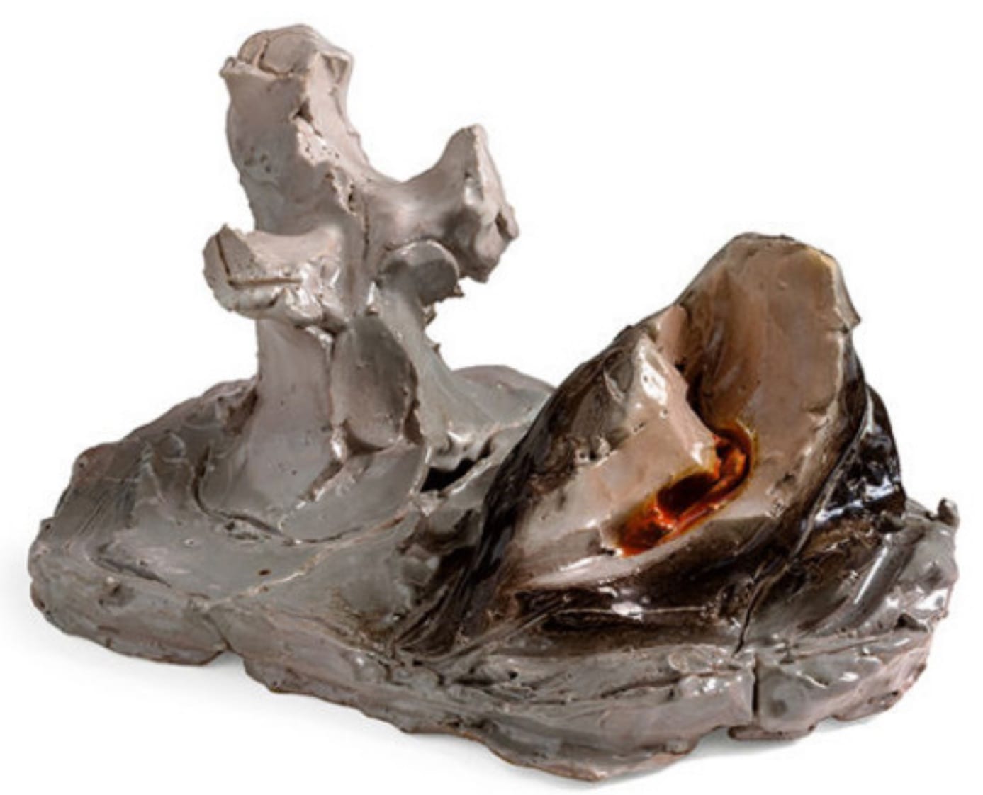
Isolating the ceramics gives individuality and stature, herding ceramics together treats them like collective class of object.
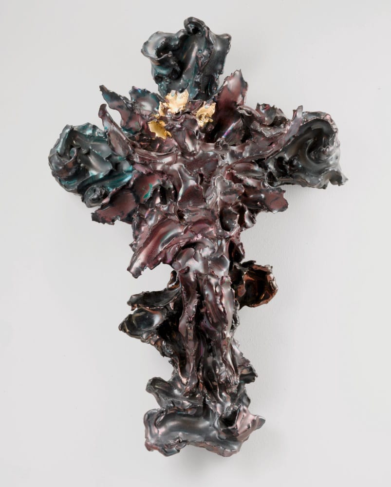
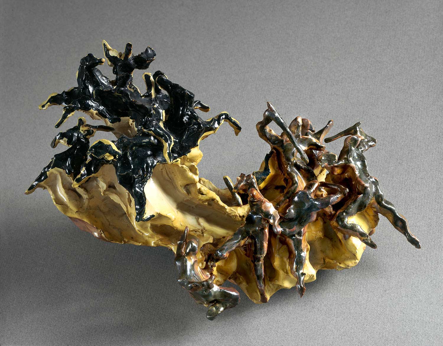
Had the curators taken just twelve of the best in the exhibition and offered them as serious pieces of sculpture, the impact would have been different. Because glaze is so complex; a running coulee of colors, minute but key globules of gold flashing light, transparent gloss over matte engobes, patches that were cork dry others that showed a scattershot of grog. Sometimes all of these on one piece.
This is much like looking at jewelry, one needs to be close. Light has to be penetrating. Close up one appreciates Fontana’s baroque, frenzied surfaces, modeled with indecent haste. Again I will be pedantic because I have spent my adult life showing ceramics, let’s say 18 inches away.
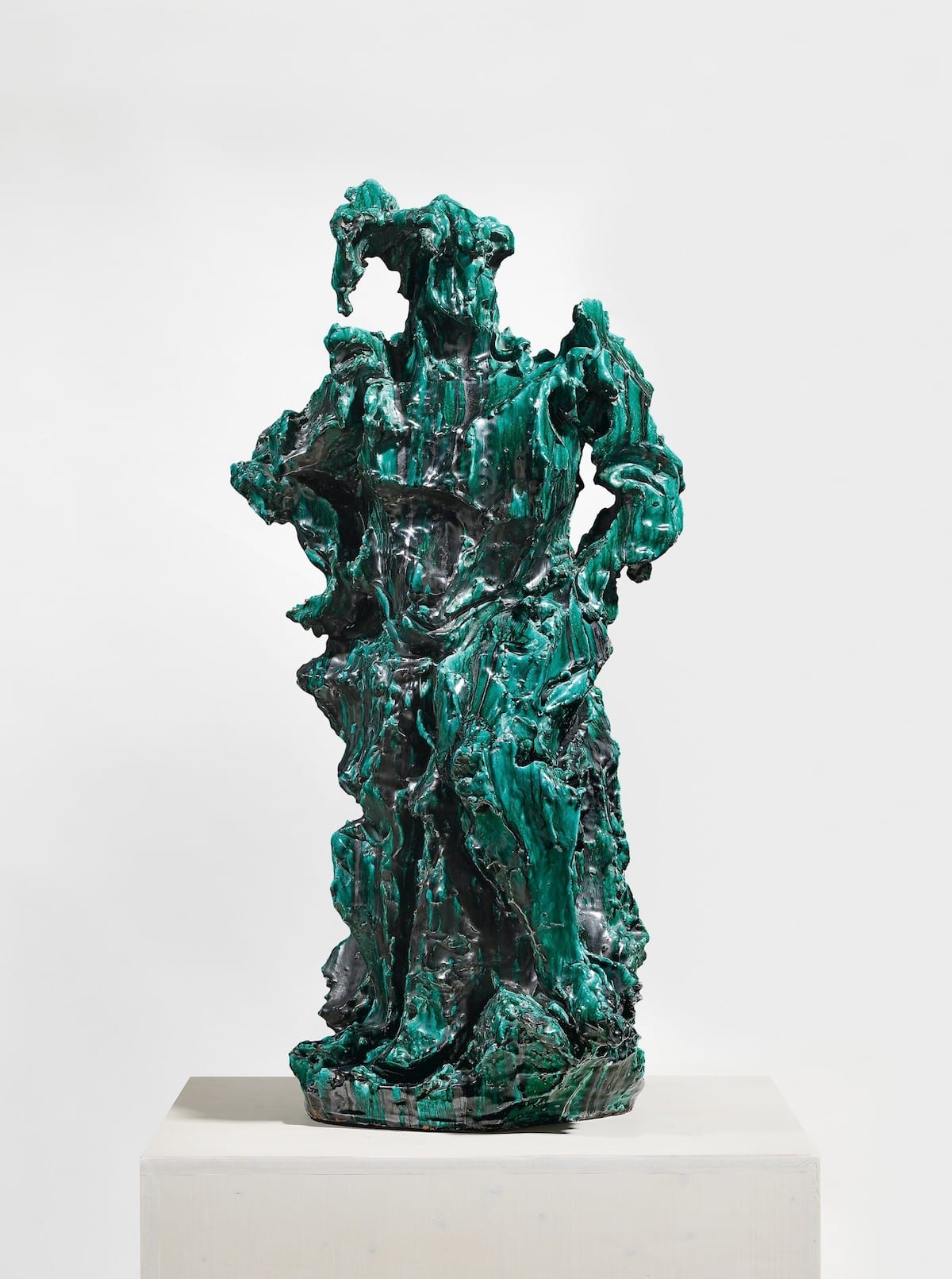
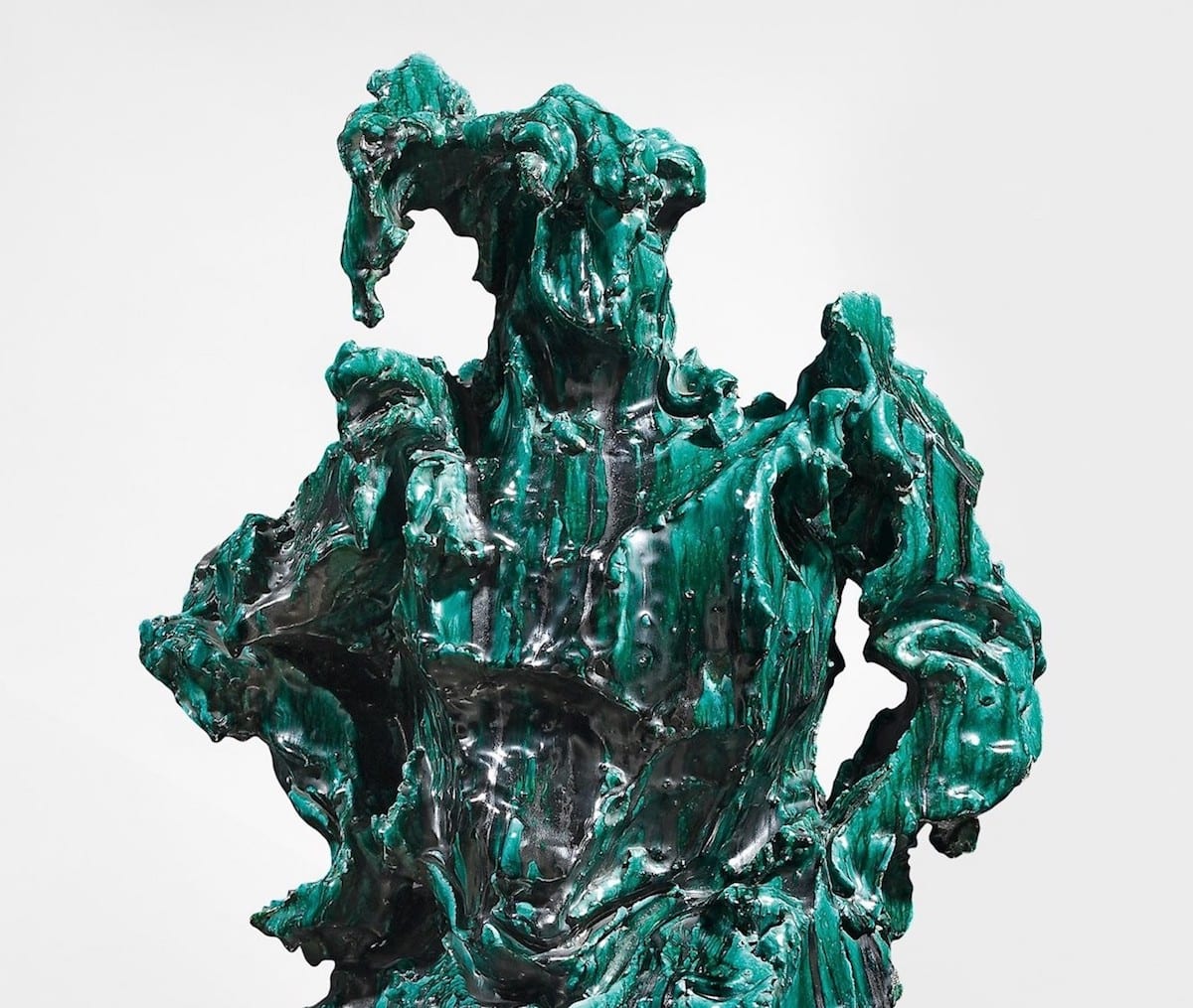
The master works were few. However, to give credit, one of his top five works Il Guerriero (The Warrior) is included but with its back to the wall. Why? There was a lot of floor space. Its kryptonite green glaze, oozes and drips, glowing with a toxic urgency through a black shroud. It is a powerful important figurative sculpture: primordial, fierce, bizarre and organic.
There are few others that rate an A or at least B+. However, omissions are as upsetting. The Natura series Fontana’s is his most important piece of sculpture outside his spatial installations (a large example is on show at El Museo del Barrio because Lucio was born in Argentina) or his light work (another of these is show at the Met on 5th Avenue).
It comprise giant ceramics (Fontana crudely called them “balls”) resembling meteorites with powerful gashes. They were shown in Venice in 1959 and to a mixed reception. The Natura found a new life in bronze and are among Fontana’s most iconic works. This show is represented by three puny Natura pushed up against the wall with a gathering of toehr works, sans context. This omission is difficult to forgive.
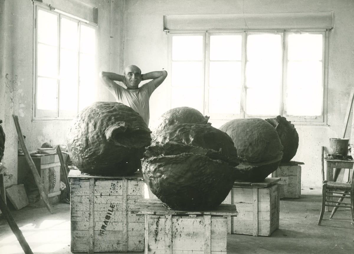
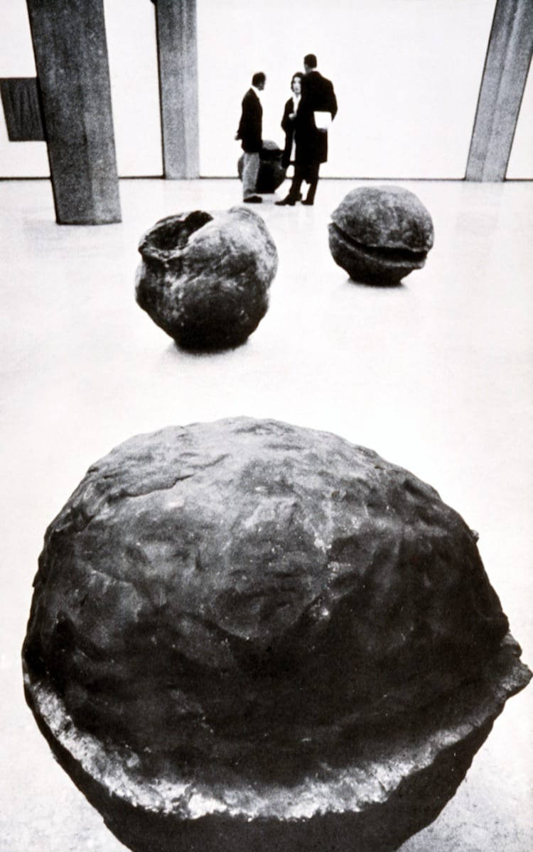
Maybe it happened because the curators made the error of thinking of him as a painter, and of course, what could be more important in art’s hierarchy. Fontana was a sculptor from the beginning to the end of his life and his painting is informed by that sensibility as Cotter wisely noted. Fontana also thought of ceramics as being as significant as any other aspect of his art.
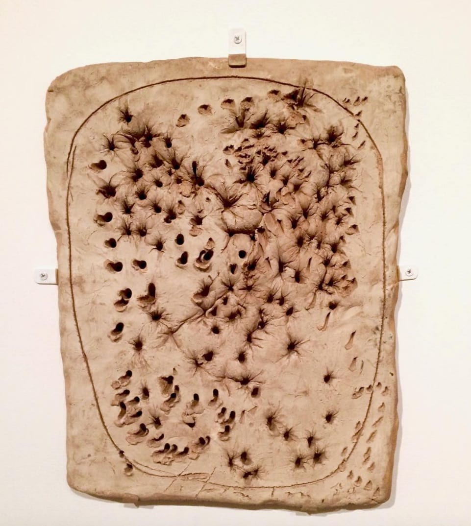
Many ceramics came from the Fontana Foundation in Milan (38 in the total show). Works such as Spatial Concept, The Bread (Concetto Spaziale, Il Pane) have been trolled out on every exhibition for decades and appear in every book. This repetitive suggest his ceramics are few.
In fact Fontana made over 2,000 ceramics from 1926 to 1968. His first exhibition as a sculptor in Milan in 1931 was of painted earthenware slabs with drawings cut into the clay and painted. Where were they on the show? Ceramics was his primary medium between 1935 and 1947. He worked in ceramics his entire career. In 1968 the year he died, he produced his first works in porcelain, powerful Spaziale editions in white black and gold. And at last the Fontana writers a realizing (it only took them a half century) that the Buchi and Tagli came from his early years of making ceramics.
In the comments on his ceramics in the accompanying book it is apparent that the organizer’s grasp on this medium is tenuous. They speak of terracotta and ceramics as though they are two different mediums. Fausto Melotti’s role as his first ceramics tutor is not noted. Nor that Fontana began his career in Milan as a sculptor with ceramics. But kudos goes to Iria Candella who writes in the accompanying book that “In an archeological reinterpretation of Fontana’s work, the sophisticated Cuts reproduce a sculptural gesture that the artist has been practicing for two decades through the modelling, incision , and marking of wet clay”. This realization been a long time coming even though Fontana himself stated that “Until I found ceramics, I did not know what I wanted to do.” Mother earth was his muse.
Not only has the Ivory Tower been slow in realizing the centrality of clay it is only just dawning on the ceramic world that Fontana that he is the most innovative and important ceramist of the 20th century. Yes, ceramist. No else one even comes close. (Sorry Peter Voulkos.)
The curators did do one thing right, possibly by default. Ceramics was spread around all over the show and this ubiquity, despite the kamikaze installation and uneven quality, suggesting it was somehow central to this art. Its a pity that on the exhibition the glory, passion and physicality of his fiery art was so poorly represented.
Love or loathe this review from the world of contemporary ceramic art and contemporary ceramics? Sound off in the comments below.
It’s always a treat to read his reviews I always come away more informed, we live in a world where most art critics stories read like press releases.Thank you
Absolutely can not wait until we get Garth’s book on Fontana! “A must have”
The Borghese Gallery in Rome is presently showing “Oro & Terra”, exhibiting Fontana’s works (paintings and ceramics) alongside and within the historical collections (Caravaggio and Bernini, among others). I was surprised how they hold their own in such company. Possibly because the paintings were mostly using gold as a primary color and most of the ceramics were Crucifixes, which made the transition between the historical works and the Fontanas somewhat seamless. Powerful and refreshing. I too look forward to Garth’s book on this artist, written with passion I am sure and most importantly from an informed position, most certainly.
Garth Clark’s writing on Fontana is brilliant — showing how LF’s meticulous, sensuous personality and his contradictory art historical influences turn into his unique ceramic practice — see GC’s Fontana chapter in “Shards.” But given the importance of the Met’s big Fontana show and GC’s special Fontana expertise, why is this review so careless? why so many trivial mistakes and obvious typos? why is it appearing five months after the opening? It would have been wonderful to experience Garth Clark’s text about the exhibition together with the exhibition itself. I’m looking forward to his book on this great ceramic artist (which I’m sure will not be careless at all.)