I met a guy once who had the job of shipping works of art across the country. The job had taken its toll after a few short years. He was a nervous wreck, his eyes sunken and dark. You could picture him swigging Pepto Bismol straight from the bottle, muttering half-articulated prayers that his shipments would reach their destinations safely.
Packaging is a design discipline in itself. We noticed a few recent examples of contemporary ceramics packaging that ensure the safety of the items they hold while also being aesthetically pleasing, even enhancing the work they contain. We’ll run down a few of those today. In keeping with our theme for the week, pay attention to the interplay between the white ceramic and its packaging.


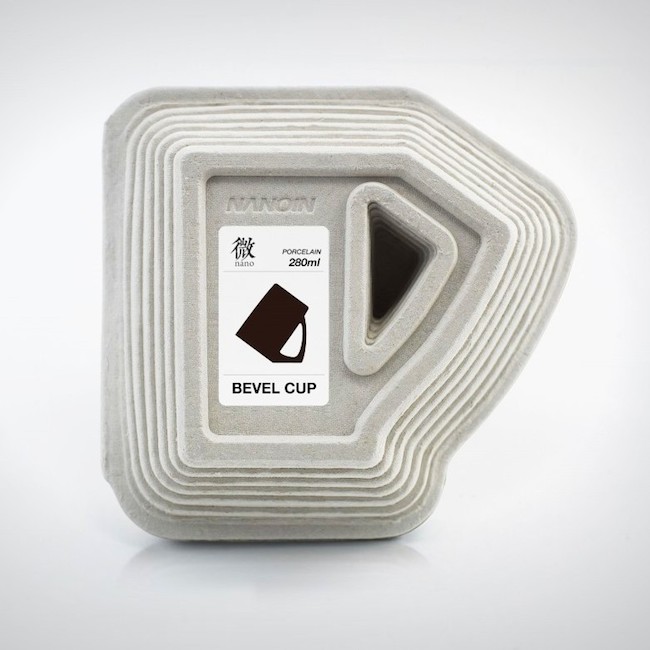
We wrote about the sanitary Bevel Cup a long time ago on CFile. We had a little fun with Nanoin’s super-fastidious design to keep dust from dirtying the coffee mug. The packaging, which won an iF World Design Guide award last year, is about as obsessive compulsive as the cup it contains. iF states that the packaging is made from pulp casting, which is both low-cost and environmentally sound. The pulp is poured into a mold that is designed to hug the mug. In addition to keeping the mug safe, the package has the added bonus of suggesting the mug’s unique shape.


The work of Los Angeles artist Cleon Peterson articulates a stark worldview, one of sex, drugs, and murder cast in the style of Greco-Roman vases. His collaboration with Case Studyo, Destroying the Weak, was a 23cm high sculpture in white porcelain that depicted two men in the act of stabbing each other to death. The unflinching violence, abstracted so that it could be coming to us either from the Bronze Age or down the street from your house, is combined with a title that evokes the stinking depths of social Darwinism. The package and the white porcelain give this grim work an unexpected twist.
Peterson’s work leans on graphic design, explaining why the image screen printed on the side of the wood box translates so well into two dimensions. The box is signed and numbered by the artist. It’s a clean and pristine package, housing clean and pristine white porcelain sculpted into a shape that will plunge you directly into a black hole. Too bad it’s no longer available.


Yield Design company’s French press uses ceramics to keep a consistent temperature throughout the vessel. The packaging is matt white which is contrasted by a gold foil silhouette of the French press. Packaging of the World states that the graphic “hints at the measurements and ever-changing levels of brew contained within. The product is an elevation of a standard household item and the packaging is designed to communicate that difference on the retail shelf.”


Zeitgeist Toys out of Berlin makes slick porcelain toys/sculptures that draw their look from pop art. The handmade and hand-painted works share some of their visual vocabulary with cartoons and retro video game sprites. It hits me right where I live. It’s been a while since I wanted to impulse buy something this badly. Their signature design is called “White Knight,” a lean little guy wearing a round helmet with a cross cut into the visor.
The packaging for the porcelain warrior is a simple white cube. The figure rests in a perfectly cut foam indentation. We imagine that the “unboxing” (geek slang seems appropriate here) is such a pure experience that your mom’s complaints that you spent eight hundred euro on a toy will barely register.
Bill Rodgers is the Managing Editor of cfile.daily.
How can packaging help or hurt contemporary ceramics? Let us know what you think in the comments.


Add your valued opinion to this post.