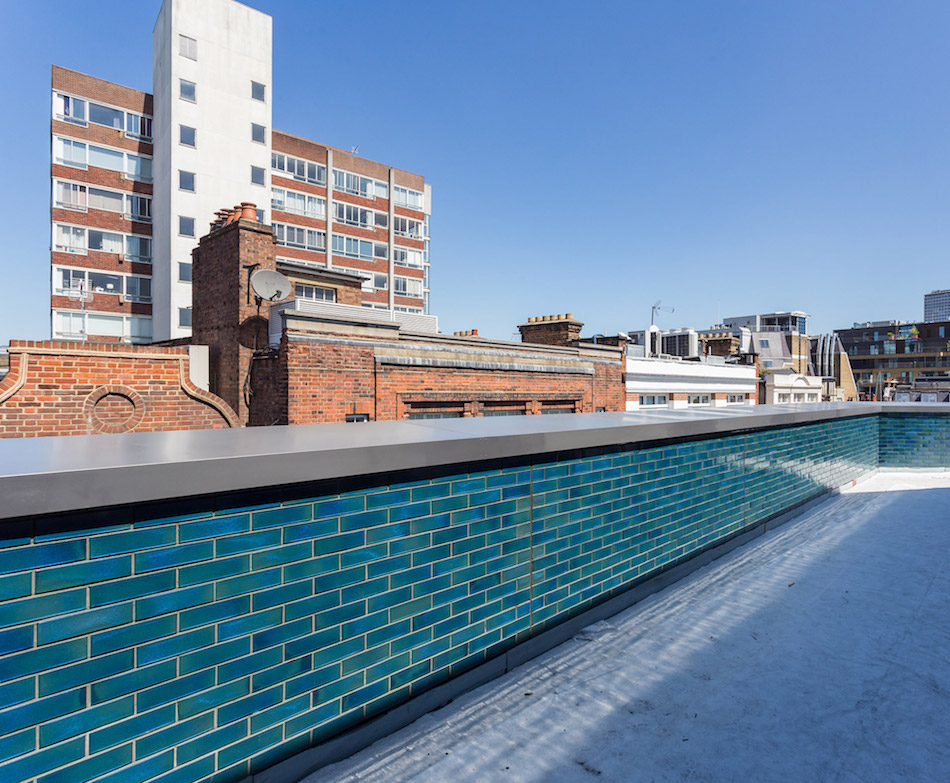
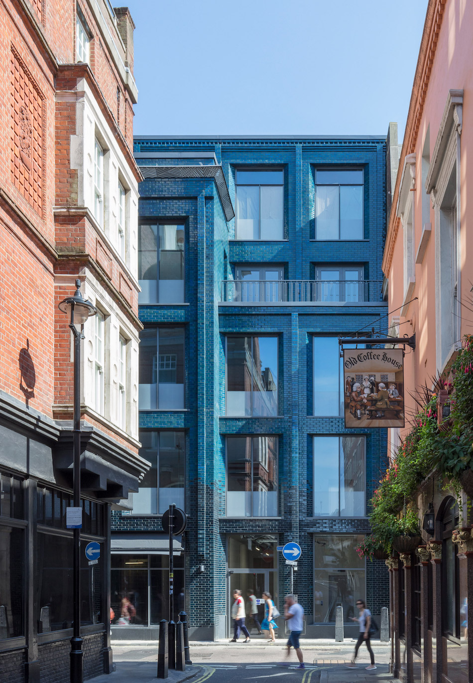
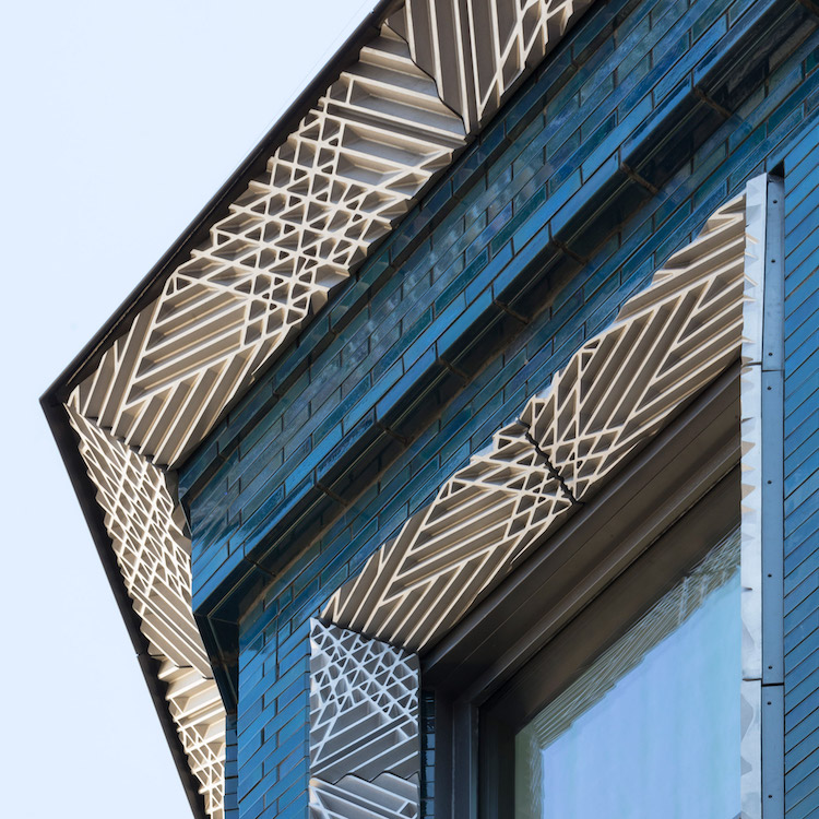
LONDON + BEIJING––A deep blue facade of a corner lot row house rises from the ground level transforming into an iridescent turquoise in an ombre effect. The deeply hued glazed brick is encapsulated by an intricate Art Deco-informed cornice and window surrounds––designed by Lee Simmons––offering the illusion of deep relief and texture.
The intention was to ground the structure and prevent it from appearing as one solid block, and to highlight the process of hand dipping each glazed brick.
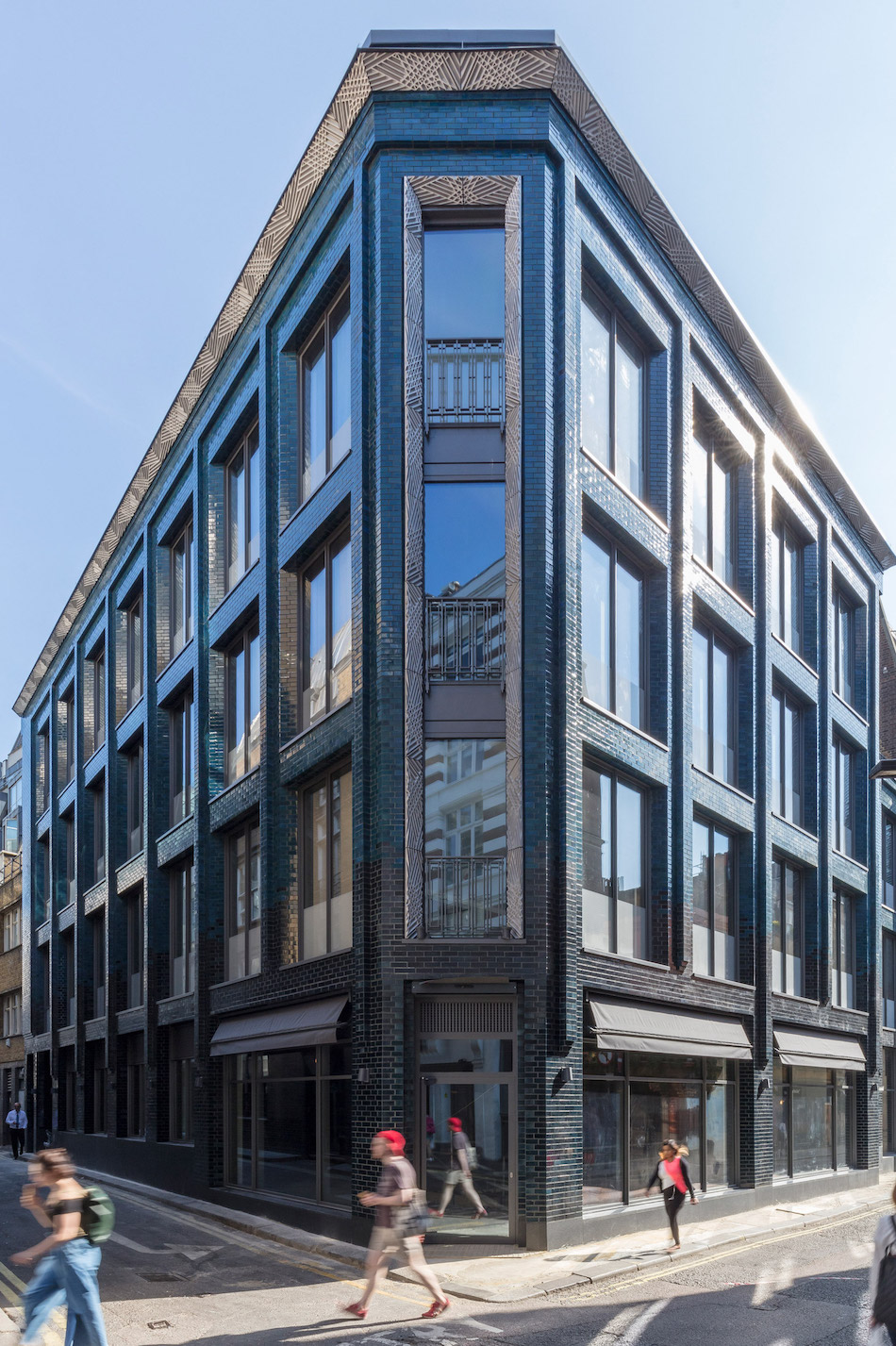
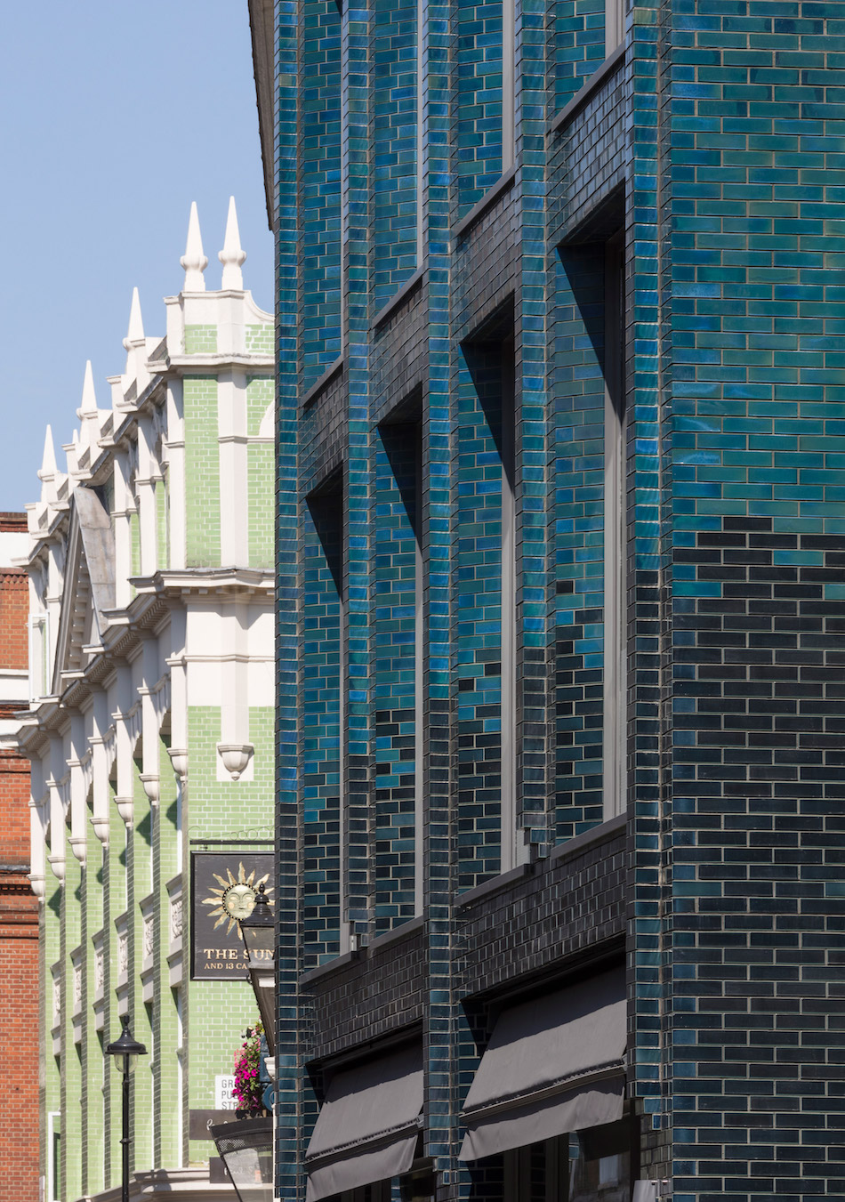
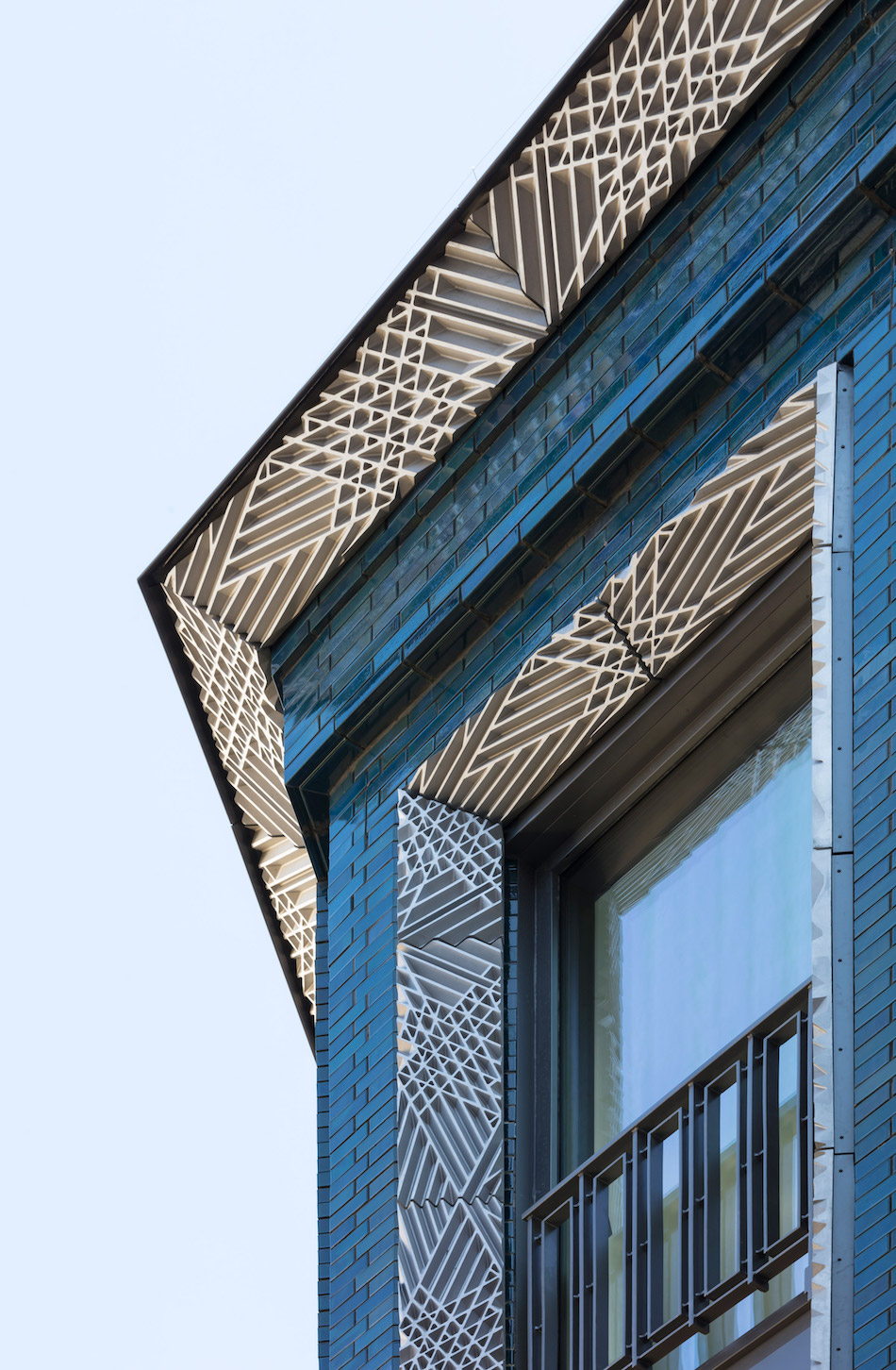
Designed by London-based architecture studio Stiff + Trevillion, the building was designed as a flexible, creative workspace, as the architects didn’t know at the time who would eventually occupy it, as Dezeen writes.
Turns out the 40 Beak Street building would attract the interest of British contemporary artist Damien Hirst, who now uses the building as his new Soho studio and headquarters.
Completed in July 2018, the 27, 742 sq. ft., five-story building also features a ground-level restaurant and a basement.
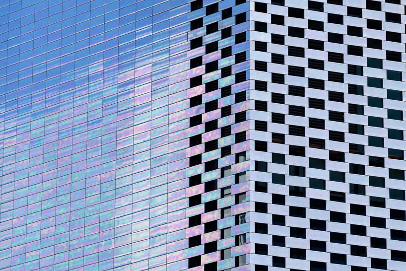
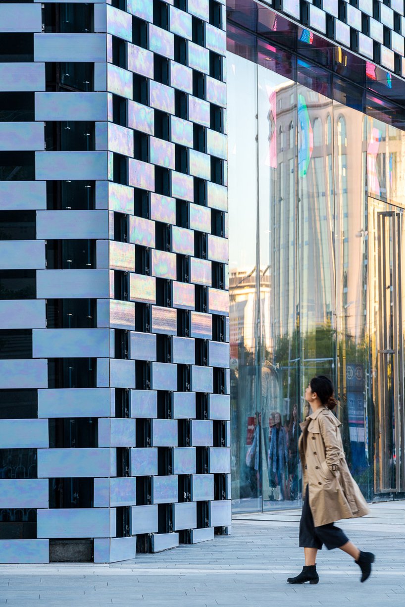
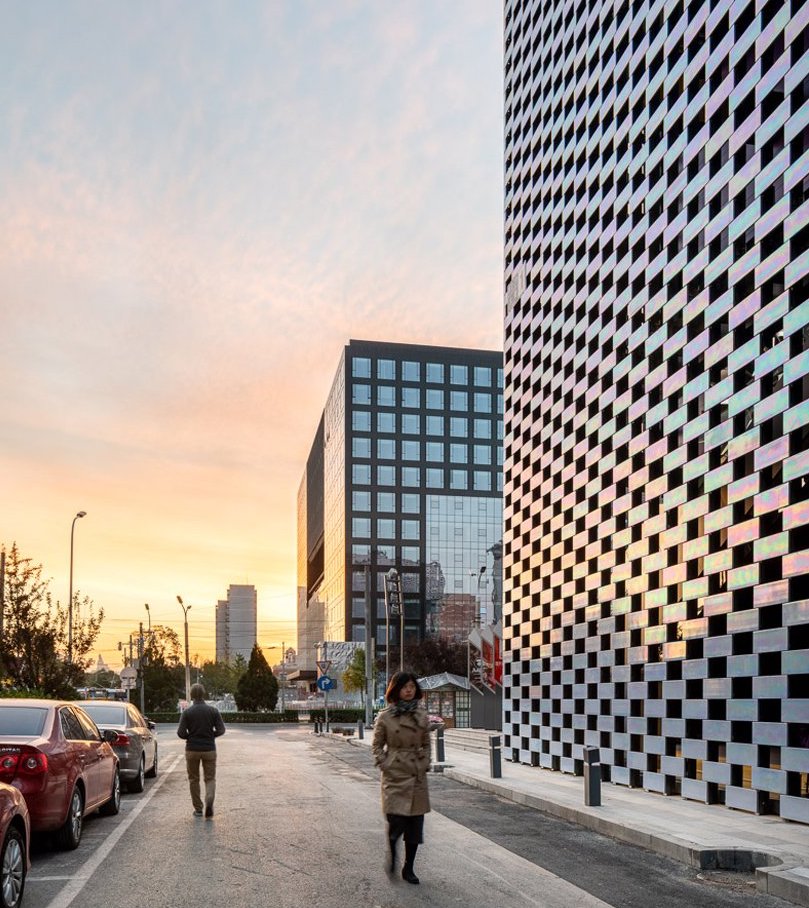
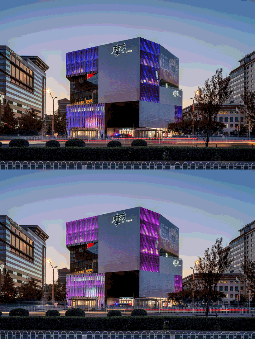
Meanwhile, in Beijing, Dutch architecture firm MVRDV, has wrapped its client’s retail and dining center––M-Cube––in a pearlescent tile.
From MVRDV:
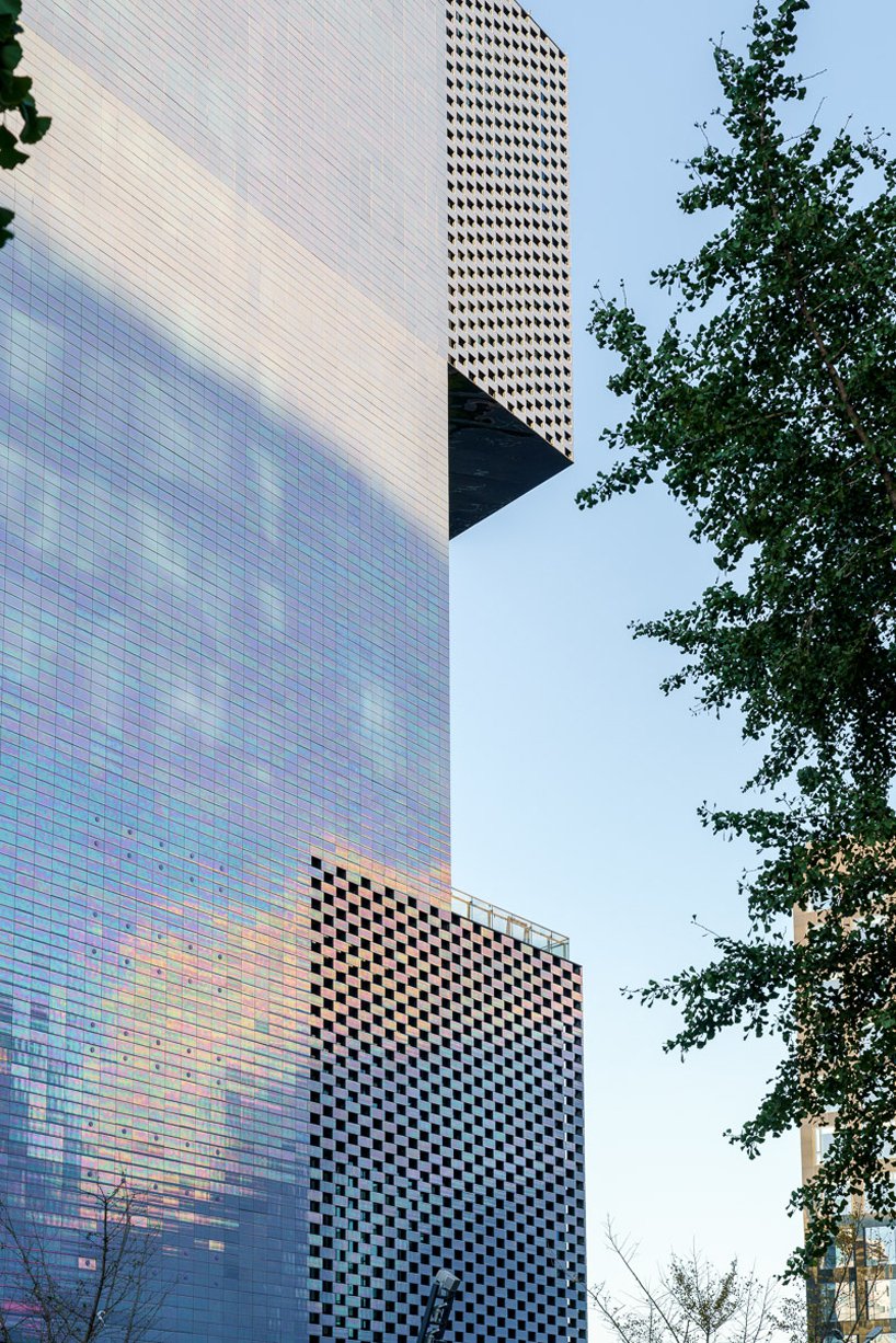
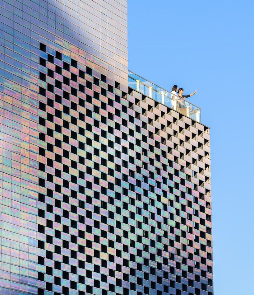
The 40,000 m2 project consists of a singular building that combines day-time shopping and vibrant night-life, acting as a major hub in the central district of Chongwenmen. MVRDV’s primary innovation in the construction of the project was in developing a pearlescent façade.

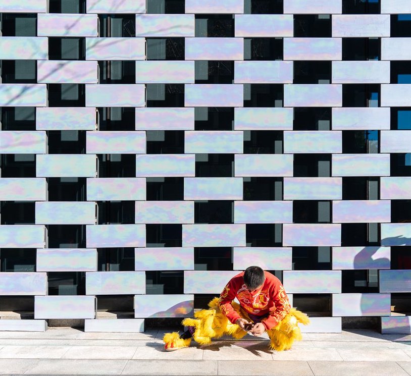
Working with manufacturers NBK and HDTC, MVRDV developed hand-glazed tiles to make up the building’s facade. The tiles reflect a spectrum of colors and patterns that fluctuate as lighting conditions change.
“The façade design balances between the desire of the client to create a striking building and the restrictive architectural conditions in that part of Beijing, demanding greys and beiges. Depending on the viewpoint, both parties can be satisfied as the façade material appears differently when looking at different angles, it varies from subtle grey to all colors of the rainbow.” –– MVRDV co-founder Jacob Van Rijs
Love or loathe this architectural highlight from the world of contemporary ceramic art and contemporary ceramics? Share your thoughts in the comments section below for a chance to win our “Best Comment of the Month” contest. One lucky commenter will win a copy of the book Shifting Paradigms ($100 value) signed to the winner by our very own Garth Clark and Mark Del Vecchio (priceless).
Love this coverage of ceramic tiles used in public spaces.
The glazed bricks framed and softened by the Art Deco textures on 40 Beak St seem beautifully understated yet mysterious. The subtle ombré gives the building a constant spotligh effect, and the blue looks great against its neighbouring buildings. However, I fail to see how having the bricks individually dipped really adds to it (I suspect there’s an industrial process that could render a similar random-ish patternation).
I’ve read coverage of M-Cube in other articles, and without comparison of other tile works in contemporary urban spaces, M-Cube seemed tacky, even though the idea of giving a soft reflection of its surroundings sounds beautiful. So seeing it in context with 40 Beak St in your article really helped me see M-Cube in a different light (oops pun).
All in all, loved your coverage which showed us architects utilising ceramics to really give their work a site-specific aura.