This is part of our summer series about art and design graduates. Please read our other post on that topic for this week.
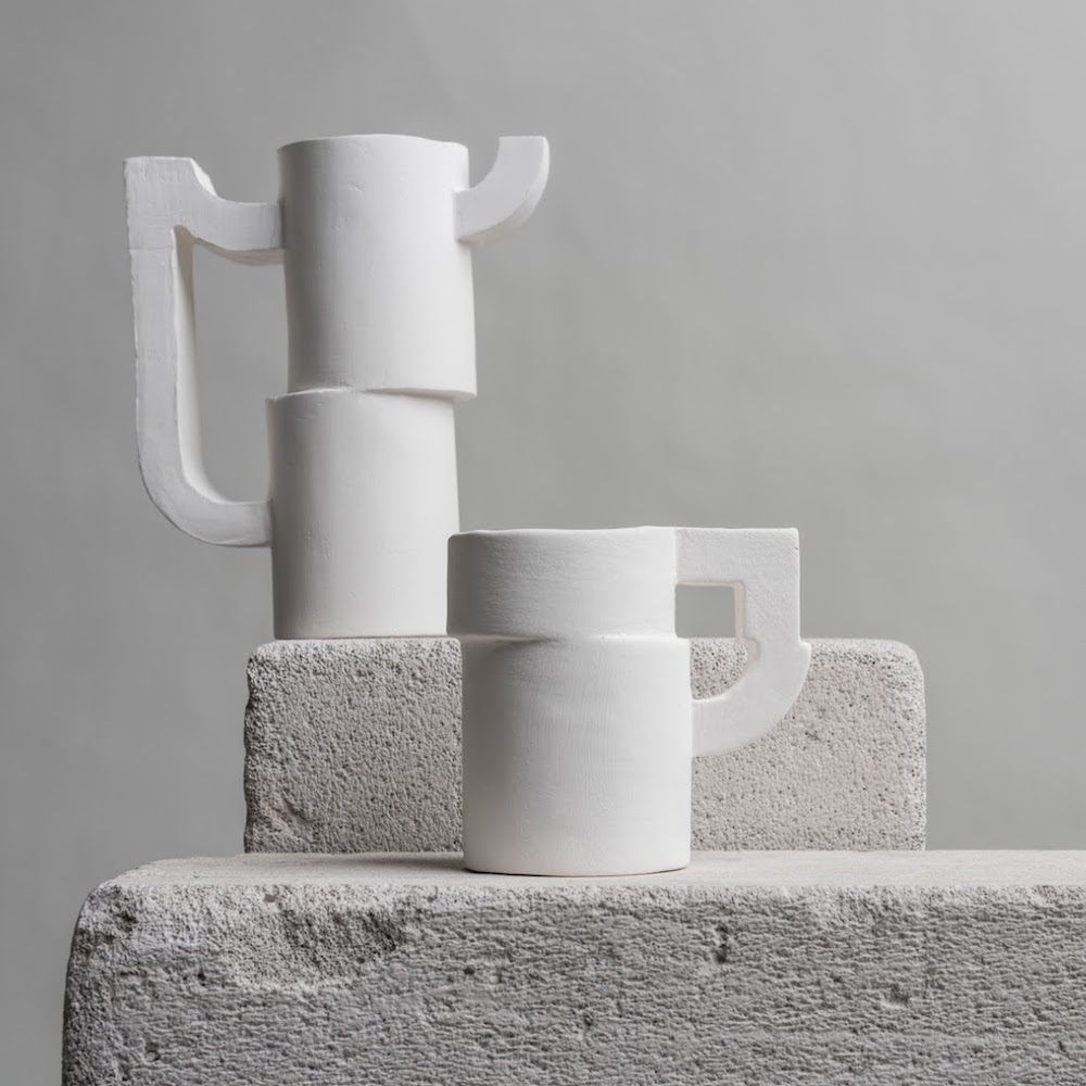
MOSCOW, Russia — Yes, you have seen the cup above by a student and you are horrified. It looks as though it is carved from a chunk of dried toothpaste. It’s coarse, ugly. The handle is designed for high discomfort and you might assign it an F, but I would give it an A+.
Why? Well, the first reason is that this comes to us from Packaging of the World, a site we love because it turns up presentation gems for ceramics. That means that the creator, Vika Nurislamova, is a graphic design student, not a ceramic one. Let us set the ignoble cup aside for a moment.
If you look at the packaging it is perfect, smart, contemporary and elegant. It evokes the product and (even more impressive) it all comes from a font design she created called Structura. Nurislamova explains:
“In this project I wanted to use all my knowledge and experience in graphic design to produce physical objects. I have created a collection of modular ceramics based on the elements of my STRUCTURA typeface. The final outcome turned out to be multidisciplinary. It lies between typography and product design, digital technology and handicraft. From the conceptual point of view I explored the idea of ‘human error.’ Nowadays, when everything can be perfectly produced via a click of a mouse, the hand-made products have obtained the specific value of unique objects. Even the little faults inherent in such things have become the indexical signs of the human soul. The name of the collection — SLIP — combines in itself several meanings: a mistake, a sliding movement [look at the S in her font] and the actual process of casting ceramics.”
What about the ceramics themselves? They are prototypes, not finished products and this suggests a direction that the ceramics will take, all of which is promising and with refinement can be both handsome and functional. Put it all together with her font design, great merchandizing and attractive eye-catching photography and she gets an A+. She is ready for prime time.
Moreover, there is also a reference in the ceramic design to the ceramics of the founder of Constructivism, Kazimir Malevich. SLIP as a concept is cool, has aporcelain legacy, invention and we hope it will develop into a fully-utilitarian product.
Garth Clark is the Editor-in-Chief of cfile.daily.
Do you love or loathe these works of contemporary ceramics? Let us know in the comments.


Add your valued opinion to this post.