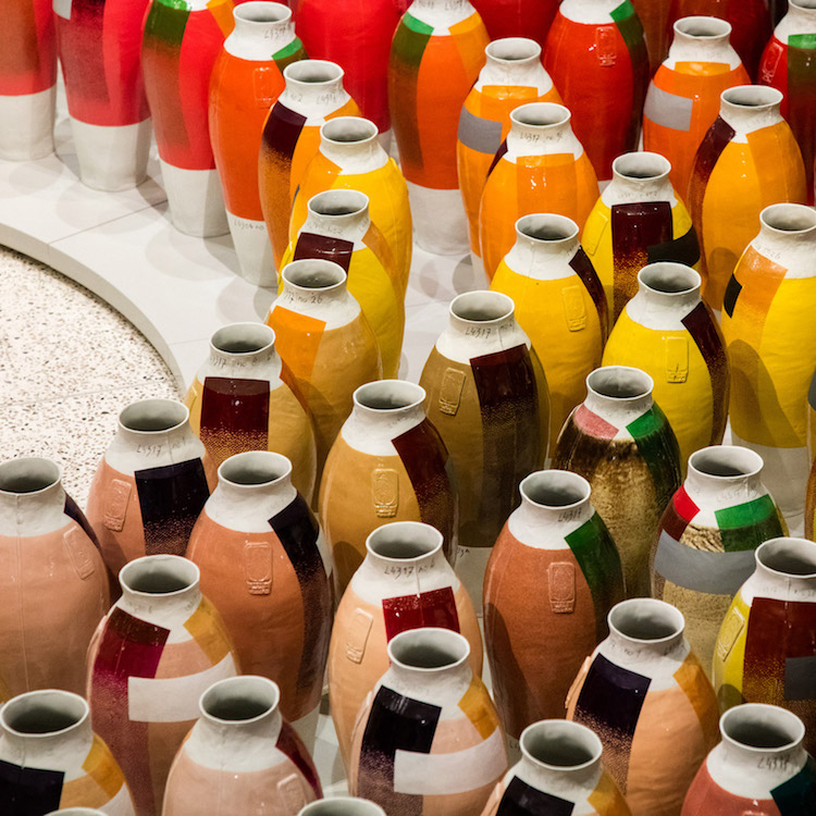
LONDON — Dutch designer Hella Jongerius’ exhibition Breathing Colour at London’s Design Museum (June 28 – September 24, 2017) experiments with manipulation of form, material, hue and light to explore the relationship between those variables and how color is perceived. This is especially evident in Jongerius’ jaw-dropping, gorgeous wheel of vases, which have been lacquered with metal oxides. Each step in the round yields a new account. brace yourself


From the artist:
We see the world in a rich mix of colours, but we rarely appreciate how complex they can be. We often view colours as consistent, categorised by paint charts and standardised colour systems. Colours were once produced by mixing pigments into infinite permutations, but now we select them according to a name or code on a chart.


The exhibition blurs the boundaries between art and design, the museum writes. Drawing on Jongerius’ extensive decades-long research into how our minds interpret what our eyes behold — utilizing three lightscapes in three spaces, each simulating morning, noon or night — Jongerius asks observers to question the way they experience color.
These three phases explore the impact of changing daylight on our perception of colour. Each installation includes a series of three-dimensional objects as well as textiles, some of which are hand-woven while others are produced on industrial looms.


Color Catchers

Exhibition view. Color Catchers and Textiles.
The exhibition also includes Jongerius’ geometric vessel-like “color catchers.” She tells Dezeen she doesn’t use any black to attain darker hues.
“In the five greys in the colour catchers, I don’t use any black. It is a mix of whites and reds and greens to make greys. It’s so wonderful, and it’s a totally different kind of grey that we can buy as industrial designers as plastic granulates or in powder coats. It’s a much nicer way of getting a dark colour – it’s multilayered.”

Color Catchers

Exhibition view. Color Catchers and Textiles

Exhibition view. Color Catchers and Textiles
Jongerius, who serves as art director of colour and surfaces for Vitra, tells Dezeen that colors can breathe if you used right, and she explains that’s a game changer for how the industry can utilize color while maintaining the color’s integrity.
[She] argues that the processes of industrialisation have narrowed our experiences of colour. This exhibition explores how we can‚ let colours ‘breathe’ again and look at them in a more intimate and personal way.
Be sure to check out the Q & A with the Design Museum here. Our computer screens just can’t do this exhibition justice. Luckily, the it’s ongoing until mid-September.

Exhibition view.

Exhibition view.

Do you love or loathe these works from the worlds of contemporary ceramic art and contemporary ceramic design? Let us know in the comments.

Great looking vases. I know this exhibit is four years old, however if you have any inventory, are your vases for purchase? If so , what would be the shipping prices? Thank you.
Many thanks for this article. I enjoyed visiting the Design Museum and engaging with the exhibition themes, but thought it was a shame or a missed opportunity to experience colour in genuine natural light rather than in ‘the three spaces, each simulating morning, noon or night’.
As usual another wonderful article. Love the posts
I love this post and wish I could see the exhibition. Next term, I will start my Color Foundations course by showing this post!