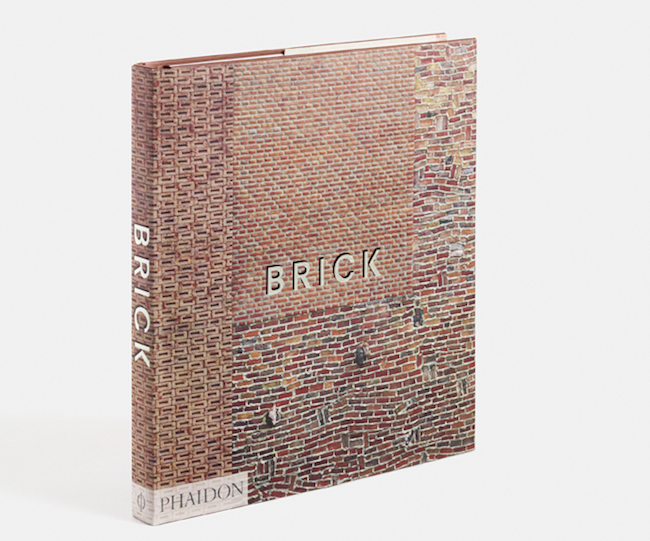
Brick
edited by William Hall with an essay by Dan Cruickshank
Phaidon 2015, London/ New York
224 pgs. 164 illustrations
Brick is a phenomenal look at the variety of structures composed in the medium from the centuries old to the very recent, but it is a look only. The text is succinct, but spartan and erudite. It is true that it tells you only what you need to know, but it is largely a visual history of brick rather than a scholarly one.

This has strengths and weaknesses; if one is familiar with brick and its uses and qualities, then this book might make an excellent resource for ideas or places to visit; if you lack that information, it will provide you with eye candy certainly, but may fail on the awe spectrum and seem, as is the flaw of the medium, a red-scale smorgasbord.
Still, it is inflexibility that inspires some of the greatest work. A medium like brick presents itself as something preset, something with straightforward uses. It’s rigidity implies an indignity toward being sculpted and it doesn’t help that if called upon to represent a brick – the popular imagination presents a 3D rectangle – in other words, a simple lack of imagination.
Brick stifles this concept and shows that a little red clay can go a long way if given to the right imagination. And the diversity of structures that brick has been used in is highlighted well: commercial, industrial, religious and residential buildings are shown in range as well as the nonfunctional; the simple decorative.
For the user of brick towards and architectural end, the book is a store of knowledge for problem solving, construction and the concerns of urban planning. Digestible captions highlight the functionality of buildings, what they are meant to accommodate and, if it so happened, how their construction was a compromise in regards to municipal concerns or constructed to respect the flow of its location.


Though the great majority, not all buildings shown are urban. Rural structures are plentiful and, as Brick indirectly points out, have a different set of requirements, most of which are aesthetic. A gigantic construct of masonry on an otherwise bare or nature abundant horizon presents a problem to the eye; people and their structures are always in harsh competition when it comes to nature and its beauty – introducing an industrially produced puzzle piece into the ‘scene’ complicates the picture. Seldom as these structures are (the majority of them very old) they please me most; they are like the iconic lone trees in a landscape, works of harmony, but towering in their individuality and stubborn necessity.
Brick itself, an object in the sense of something you hold in your hands and place upon the table for people to see, is very well put together. Despite the aforementioned monotony of its red tonality the majority of the pictures within the book are very nice works of architectural photography which boils down to an excellent selection process by the editors. Its dust-jacket is also textured with a raised surface, which gives it an unexpected evocativeness. Phaidon is good at making pretty books, a matter which they’ve proven time and again.

The text runs probably about 10,000 words which is, after all, not that many. However, this always gives the structures themselves room to breathe. They are liberated by the barest fact so as to stand honestly in their environments, toward the demands of their needs and as the structures of taste and awe and fluid rigidity that they were meant to be.
Christopher Johnson is CFile’s Book Reviewer.
Any thoughts about this post? Share yours in the comment box below.


Add your valued opinion to this post.