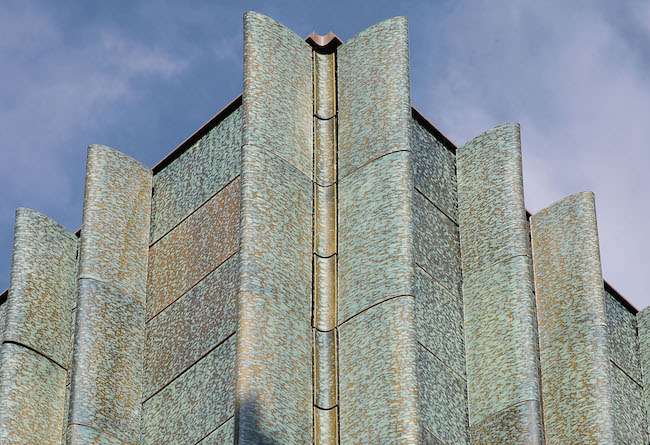
In 2011, Eric Parry architects completed work on an extension to the Holburne Museum of Art in Bath. The £11.2 million extension to the Greorgian building was contentious, at times, with the project nearly falling apart after the local council rejected the firm’s initial plans for a glass and ceramic addition to the structure.
Artist Nicholas Rena studied architecture under Parry. Since Rena has an exhibition at Holburne (reviewed here) we decided to profile the building as well.

The firm persevered, however. They state of the project:
The proposal for a refurbishment of the museum includes the provision of new gallery spaces, archives, educational and visitor facilities, to ensure a future for ‘The Holburne Collection’ in this building for the forseeable future. The role that the museum has in the community can be significantly improved, acting as a catalyst for the regeneration of this area of Bath and Somerset.
After more than 5 years since they were originally awarded the project, the firm was able to settle on a plan that utilized ceramics. They told Architect’s Journal:
Materially the compatibility that glazed ceramic and glass offered seemed a good way to work from the blind top wall (ceramic) to the lightest possible veil of glass at the ground. The mediating middle level is consequently a combination of the two with the glass a protective screen to the large scale container of the Holburne collection. The plan of the new extension was determined by the need for space and constrained by the inviolable perspective view down Great Pulteney Street. The largest plan area is given to the new top floor gallery, the first floor and mezzanine are drawn in by 800mm and to dissolve the apparent structure at ground floor level two smaller piers are offset from the corner at three corners, the fourth being a stabilizing fin wall that also carries a services riser and a new lift.
The ceramic panels were the largest the manufacturer could produce, necessitating a wall thickness of 50mm, and to avoid a grid from my earliest sketches I envisaged a series of ceramic fins that at the upper level would conceal the vertical joint and at the intermediate level would cover the stabilizing posts that carry the outer glass skin.
The laminated low iron glass veil is free of complex jointing creating apparent lightness. With the inner glazing at ground floor it forms a triple glazed wall that ventilates to reduce heat gain. The layers of reflection on the skin of the building in its foliate setting and the depth of the ceramic glaze (achieved by 2 slip coats single fired) are intentionally ambiguous. Ambiguity was an element of the architectural order of the building in the artificial condition of a garden setting within the town. The orientation of the original building reinforces this difference, sun lit to Great Pulteney Street and shadowed in the garden.
Beyond the immediate project the hope is that it will be a catalyst to recreate a contemporary garden as a world in which leisure and imagination can flourish once again reinstating the potential for Sydney Gardens to become a destination for the City of Bath.
Any thoughts about this post? Share yours in the comment box below.


The Holburne Museum as a catalyst for the regeneration of this area of Bath and Somerset.

Add your valued opinion to this post.