BEN GUERIR, Morocco, CATALONIA, Spain — We share with you two structures, each designed by different Barcelona-based firms tasked with answering the same question: How to architecturally create relationship with the community and environment? Each came up with different, yet beautifully executed, solutions. We begin with King Mohammaed VI Polytechnic University’s modernist block design scheme in Ben Guerir completed by Ricardo Bofill Taller de Arquitecturas (RBTA).


The design consists of several structures across more than 100 acres made up of solid cubes of orange plaster. The cubes are stacked with vertical joints aligned and geometrically organized in a way to foster intellectual exchange. This is done through the employment of narrow streets, partially covered walkways, tall fenestrations and a central promenade flanked by classrooms and gathering spaces. Drawing inspiration from local architecture, the square is used as a recurrent element dictating pedestrian traffic to maximize the exchange of ideas, Designboom writes.
The scheme encourages pedestrian circulation, while the courtyards, gardens and semi-covered streets bring together students and teachers, thereby promoting intellectual and social exchange, and strengthening the sense of community.


The building design, with its facilities and central pedestrian area, the design firm writes, is the heart of a larger sustainable development plan, King Mohammed VI Green City.
The urban character of the design contributes to consolidate the campus as a strong magnet. With a grid that perfectly integrates within the Green City, this concept guarantees permanent exchange between campus users and with the city and its future extension towards the east.
More features of the design:
- Five Research Centers and the Learning Center, located on both sides of the campus. The Research Centers are grouped in the same area to encourage synergies and exchange of information;
- Other facilities along the axis: a restaurant, dedicated area for teachers, the Student Center and the Medical Center, and teaching facilities;
- A hotel and the OCP Regional Headquarters facing the green extension;
- Residential clusters on the campus perimeter;
- Additional car park and green areas.

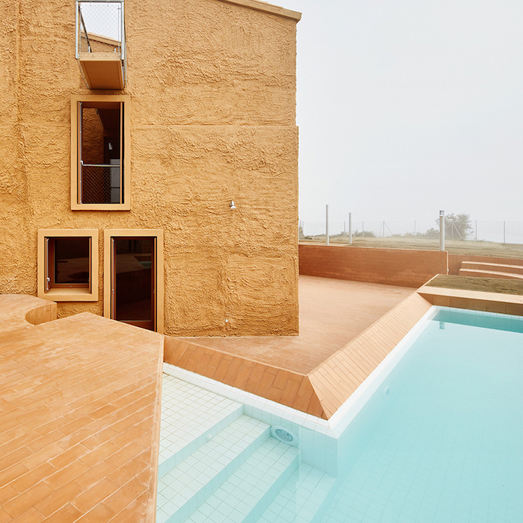
While RBTA was able to design a completely original structure aimed at nurturing relationship in community, Architectura-G design firm was challenged with having to work in direct relationship to the environment while also working within the volume of the existing walls and structure of a dilapidated farm house. Designboom writes the restrictions actually catalyzed the structure’s transformation into a single-family home located outside of Santa Margarida de Montbui.
The distinctive design factor is its visual impact; the intervention featuring a chromatic palette of earthy tones – nearly identical to the terracotta-colored landscape in which the site is based on. The materiality revolves around the idea of contrasts and this is evident in the structural elements. the load-bearing elements are rough, heavy and coarse, while the secondary elements and the interior partitions are completed in smoother and lighter finishings.


Unable to tear down and rebuild walls, the design team opted to develop and divide the interior space with a succession of platforms of variable height that rise and circulate from the brick and wooden-floor common areas to the bedrooms, ending their journey on a cantilever overlooking the adjacent cereal fields. The exterior of the structure was excavated to give access to the house directly and purely from the land. The exterior design also includes a mega-cool pool.
Do you love or loathe these architectural approaches? Let us know in the comments.


Add your valued opinion to this post.