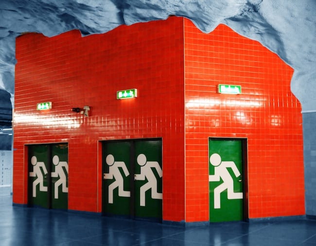
The debate over public transportation in this country has been foolishly ignoring aesthetics. This post will show you what Americans are missing out on by yoking ourselves to a highway system and turning what rail transport we do have into a drab, aluminum, fluorescent-light-lit ordeal. The Rådhuset metro station in Stockholm is an example of how creative architecture could actually make us enjoy going to work in the morning.
The station opened in August 1975 and it takes its name from the court house above. The station uses organic architecture in that the bedrock underground is exposed, looking as though you could turn a corner and stumble into the Batcave. Although we wonder whether the blood red ceiling and the tile structures depicting fleeing stick figures would be too alarming given our paranoid, security-obsessed age, the effect is magnificent. There’s balance further in with a blue and white (almost Delft) color scheme depicting people at work along the ceiling. The relief of the flower with a toothy grin likely injects some much-needed weirdness into the daily commutes of countless passengers.
Images of this station will haunt us the next time we’re stuck in traffic and the only thing we have to look at is the sun-faded “Imagine Whirled Peas” bumper sticker on the Volvo in front of us. Tragic.
Bill Rodgers is a Contributing Editor at CFile.
Above image: The Rådhuset metro station in Stockholm.
Any thoughts about this post? Share yours in the comment box below.


The Rådhuset metro station in Stockholm.
Read a passionate Metro Jacksonville post about transit rail

Add your valued opinion to this post.