Welcome to our Architecture Digest, where post loads of gorgeous images of the latest architecture, building design, and construction engineering from all over the world. In October’s architecture digest, we are in Manchester, Stockhom, Iran, and Spain. “Digest” signifies less talk from us and loads of beautiful, digestible images to ogle.
Glenn Howell Architecture | Manchester City
This stunning, slender new addition to the Manchester City Skyline was designed by housing development company Student Castle and Glenn Howell Architecture. 55-stories, but no more than 15 meter wide, red brick pillar pays homage to the thousands of brick chimneys, that once ruled Manchester’s skyline.
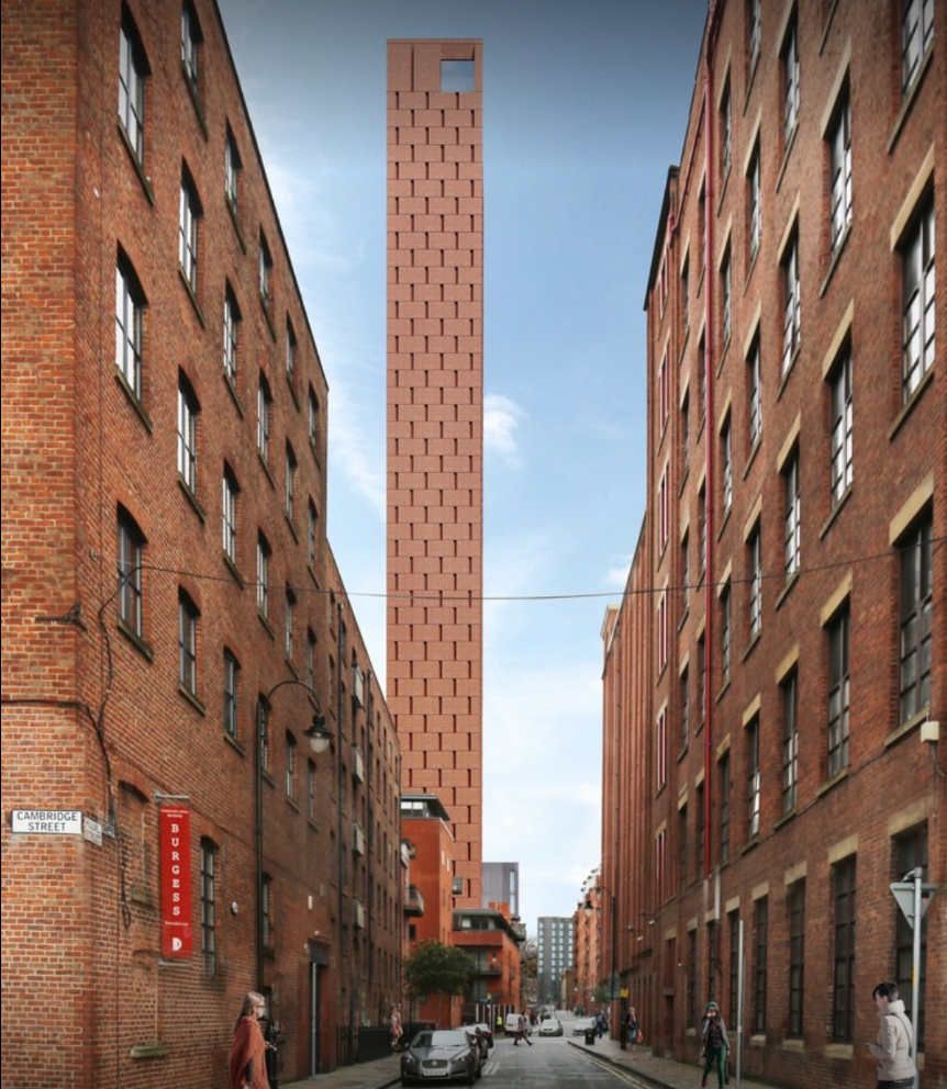
According to Alan McCartney, Studio Director for Glenn Howells:
“Rising among its context of red brick warehouses, the scheme will be the most slender structure in Manchester. The slenderness is reinforced by its homogenous skin of brick panels that alternates on every floor to open up glazed slots and add relief to the façade. The use of modern construction technologies will enable us to deliver traditional brick material at such heights in prefabricated modules.”
Christensen & Co. Architects | Stockholm
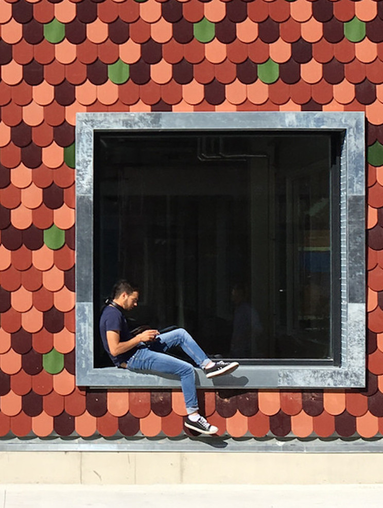
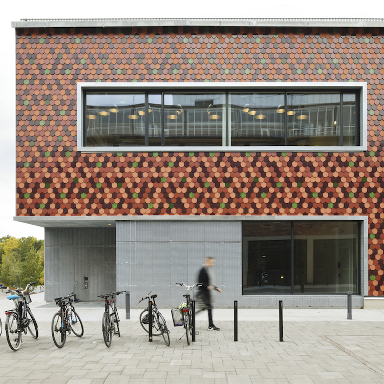
The Royal Institute of Technology-Stockholm got a new wing last year; a multi-functional education center specifically for architects, building designers and construction engineers. Not only was it designed by Christensen & Co Architects to serve its purpose in a radical, efficient way, but the colorful gradient of “beaver-tail brick” is beautiful and inspiring, especially as a student of the architectural arts. “The spiraling layout of the spatialities of the building is like a textbook in practice, where easily readable constructions and installations can be used for teaching purposes,” says Arch Daily.
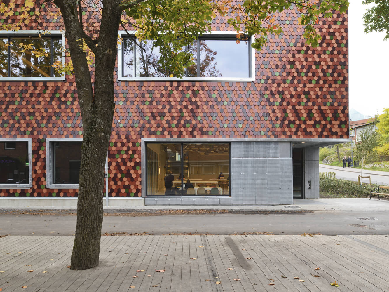
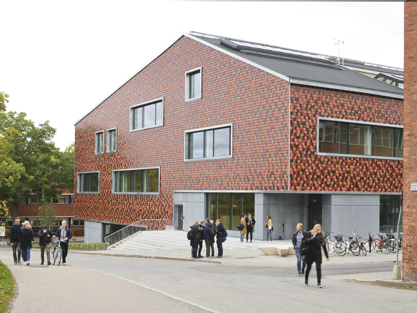
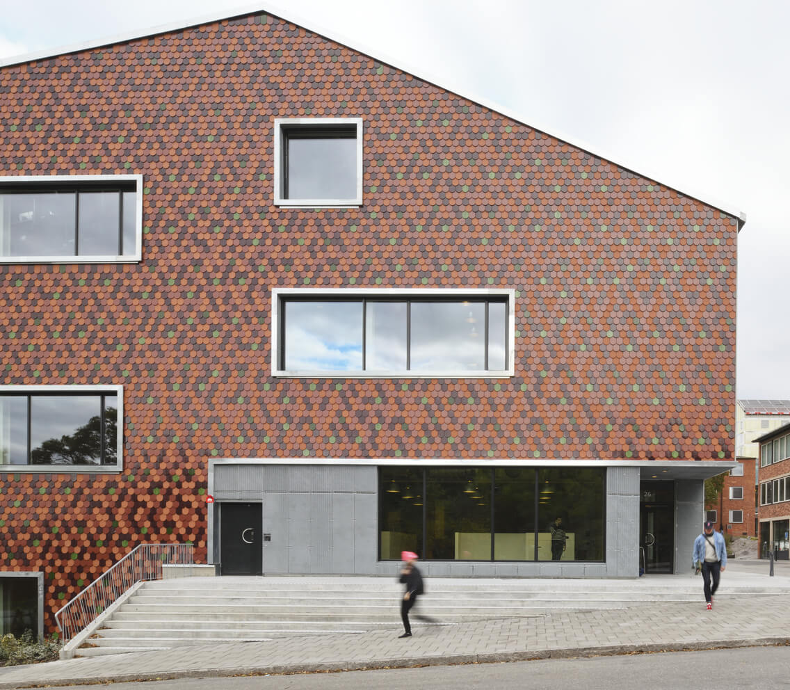

“The design derives from discussions, study trips and a programming phase outlining the ambitions. The numerous spatialities create a diverse building with large, bright, small, quiet, transparent, loud, sloping, underground, light and dark spaces. The façade is respectfully in keeping with KTH’s almost 100-year-old tradition of using brick, while the beaver tail brick is also a contemporary energy-efficient twist, which conveys the past into the future.” –Arch Daily
Laura Ortin | Residence in Beniaján, Spain
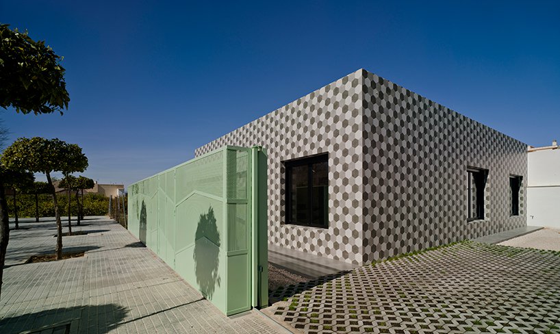
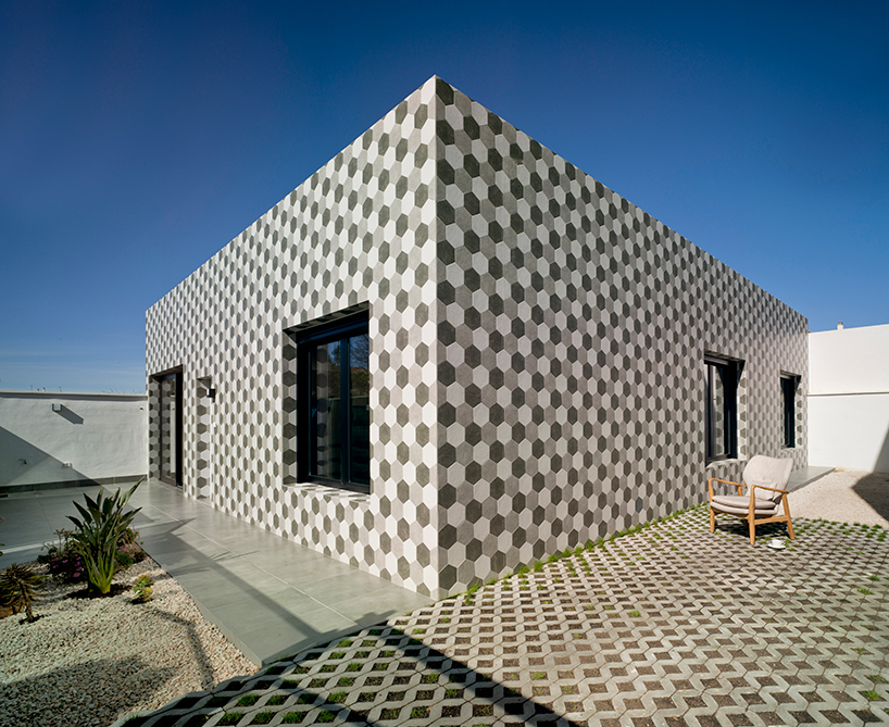
Laura Ortin Architecture designed ‘the wonder house’ for a small village in Spain situated in a warm climate. The ceramic tile pattern stays consistent with the village style, while the green fencing reflects a hillside nearby.
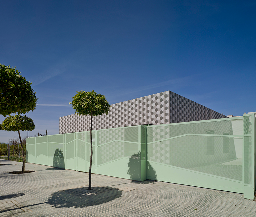
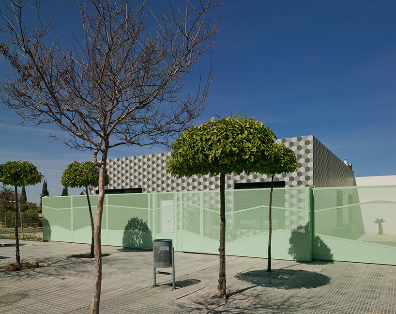
“Aware that high-rise buildings will soon arrive in the area, laura ortín arquitectura aimed to maintain a memory of the current environment with the design of the residence. designed as a unit in which shared spaces are L-shaped, the house enabling the connection between both sides of the plot and providing for views and cross ventilation.” –Design Boom

Maoom | 7,000-brick hill | Seoul, Korea
The design firm known as Maoom did away with ye ole classic table / chair combo. How boring! How provincial! Instead, thanks to Maoom, this coffeeshop in Seoul may just be the first in the world to offer its patrons a hill made of bricks to eat, drink, and zone out on. Perhaps this is an intuitive leap in the east, where the floor has since recorded history been a place for fellowship, food, drink and daily activity.

“the hill is a space where you can sit and relax for a moment, a place where one wants to rest’ notes the korean studio, ‘in a subconscious moment where the sensibility of a person is moved by the familiar experience, the message of the hill here is recognized as a space to just sit down and relax.”- Maoom Design Studio
 Jafar Lotfolahi and Omid Azeri | Kerman, Iran
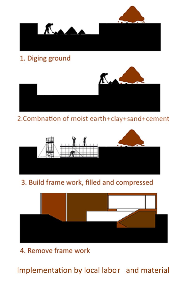
The correct proportions of cement, soil, and clay are all you need to be cool in the summer and warm in the winter. This may not be true everywhere in the world, but certain regions have the “earth home” down pat. Iran, where architects Jafar Lotfolahi and Omid Azer hail from, is one of those places.
“The volumes of Azeri and Lotfolahi’s house are predominantly solid and hidden from the outside, while transparent and open from the inner courtyard — they consist of two parts, one for winter and one for summer. The big opening in the second level of the building faces the yard and the pool in its center.” –Design Boom


Love or loathe this compilation of the architecture from the world of contemporary ceramic and contemporary ceramic art? Share your thoughts in the comments section below.
Add your valued opinion to this post.