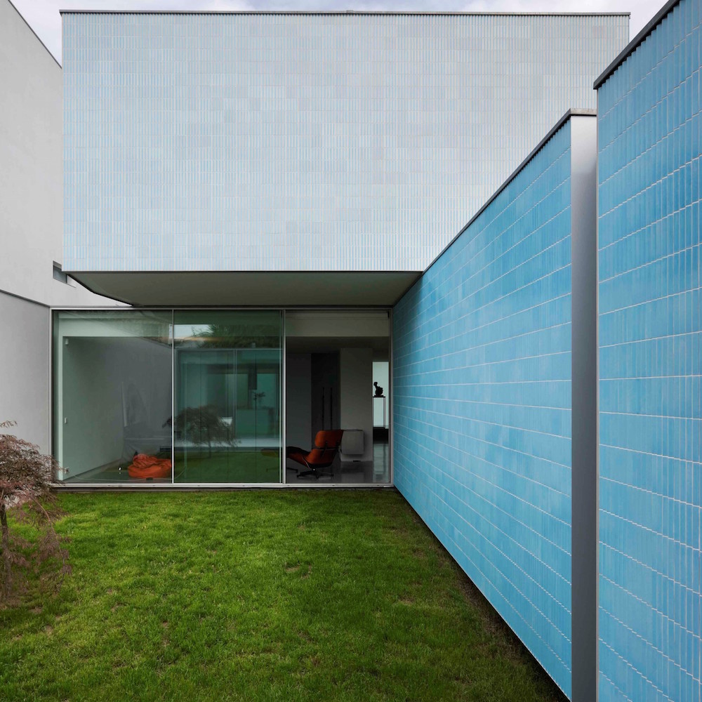
PORTO, Portugal — When I look at House Ricardo Pinto by CORREIA/RAGAZZI I’m reminded of shipping crates, which isn’t to demean them. They’re a very satisfying stack that my eye follows with ease, which is interesting for a set of perpendicular rectangles.
Above image: Photographs by Luis Ferreira Alves.
The residence continues to set itself apart with its characteristic blue and white tile. The architects state of the piece:
The use of the tile, giving new life to a Portuguese tradition, comes from the intention to explore its formal and plastic possibilities rather than only its chromatic possible variations. The tile has also the advantage of being a finishing material that requires basically no maintenance, one can use it over any constructive system and it’s eternal. We are interested in its natural qualities, its colours, textures and ability to be worked according to the different perspectives, as a different entity.
The above is loaded with architect-speak, but when they say “plastic possibilities,” my eye is drawn to the rippling effect the blue tile makes when viewed from an angle. It rises in white and falls in a cool blue. The gray tiles in the higher level compliment the blue below and create a great stippling effect through a mix of darker and lighter hues.
Bill Rodgers is the Managing Editor of cfile.daily.
Do you love or loathe these works of contemporary ceramics? Let us know in the comments.


Beautiful so simple but complex! work of art