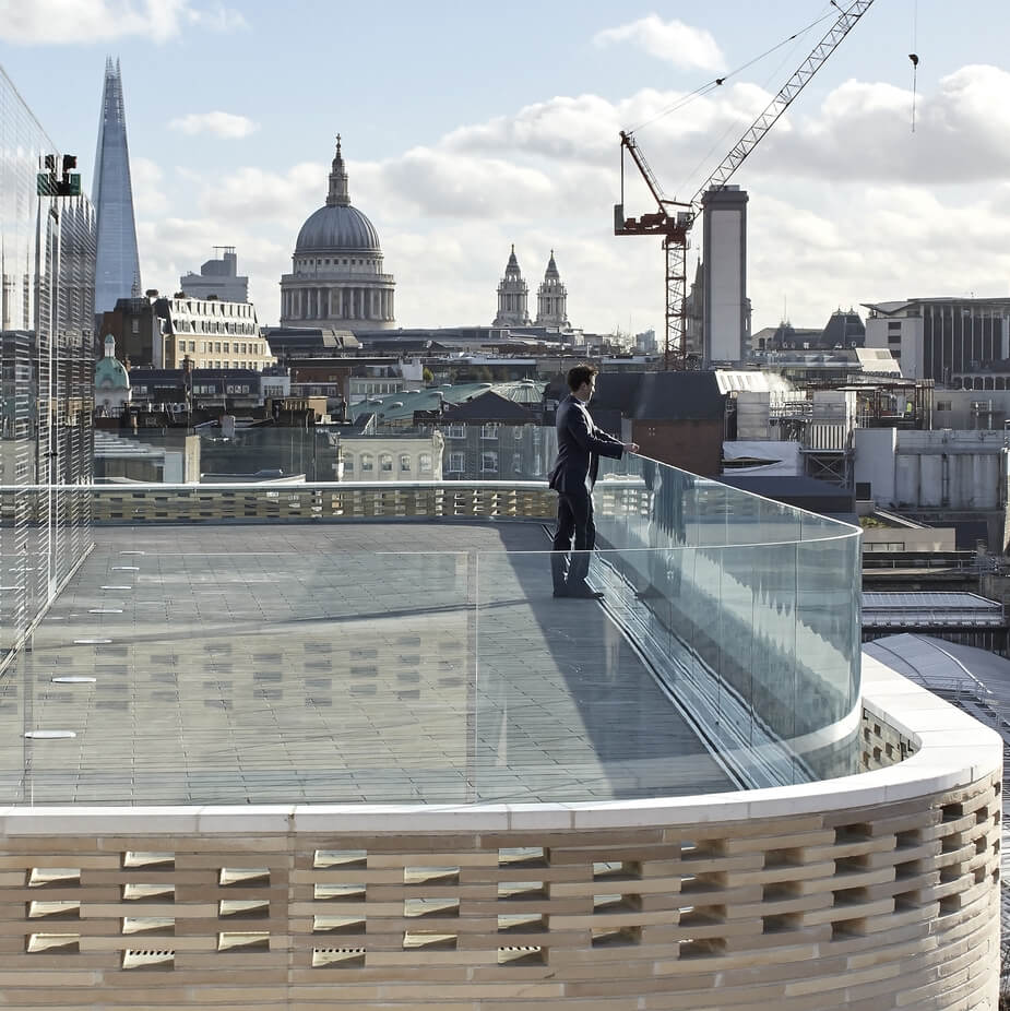
LONDON — Ever wonder why a lot of brick architecture gets posted to CFile when we are primarily a ceramics site? Today we were researching London studio Piercy & Company’s Turnmill building and came across a great couple of lines about brick from Alexis Harrison, who reviewed the building for ARUP. His comments are embedded in a video here.
“I think the language of brick is changing. It’s a material that is essentially cladding for a building, rather than a structural component of a building. Architects are really trying to use it for its unusual texture in itself and bringing an element of craft and an element of human touch back into the facade. Almost a resurgence of the arts and crafts movement, but in a digital age.”
Harrison’s comments certainly apply to P&C’s Turnmill building, a combination of offices, restaurants and stores. The term that keeps coming up is “a ribbon of brick,” a great phrase because the two words seem so at odds with each other. These bespoke bricks also have a soft texture and an inviting cream color, both things that buck anyone’s assumptions about brick as a material. The studio had this to say about the masonry:
“Handmade Roman format Petersen Tegl Kolumba bricks create a horizontal rhythm across the façade and reflect the sturdy masonry characteristics of Clerkenwell’s warehouses. The angles of the chamfered window reveals fan out across the building, optimising views out for the office users. En-masse, the varied chamfers animate the façade and emphasise the solidity and texture of the Danish brick.
“The double height reception space and glazed link above, break the building’s massing into two elements to preserve the fine urban grain of Clerkenwell. On Turnmill Street, the brickwork continues inside through the curved entrance where it gives way to a palette of polished concrete, timber, and brass.”
Do you love or loathe this work of contemporary brick architecture? Let us know in the comments.


Add your valued opinion to this post.