LONDON — AOC Studio was hired to work on a master plan to redevelop two 1970s council buildings in the Nunhead Green Conservation area. In addition to building 22 private and council homes, the studio also developed a community center.
The studio states that the building, called “The Green,” had to give residents an area to socialize, while also hosting a number of separate events simultaneously, everything from little league football to wakes. There are spillover spaces to encourage mixing, places where you can run into your neighbor at a rummage sale as you’re leaving taekwondo practice.
AOC included some visual cues that speak to the connectivity the community center is trying to promote. The first is a chimney-like structure that is illuminated from within. The designers told Dezeen that the light is a feature that references chimneys of Victorian almshouses, which used such beacons at night.
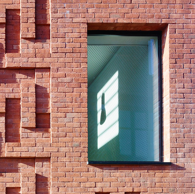
The brick harmonizes with the surrounding buildings and it’s as though the studio wanted to call attention to that by making each half of the community center strikingly different from the other half. The facade is flat on one side while the other has a herringbone pattern made out of bricks. The herringbone side is a visual response to the nearby pub, a play on the brickwork of its neighbor. The studio told Dezeen:
“The building samples the forms, materials and myths of Nunhead to create a modern building that is particular to the place and resonates with its past.”

Photographs by Tim Soar.
It’s as though the community center is sharing a friendly joke with the pub, an impression. It’s the kind of charisma that also allows the community center to assert its presence. This pattern gives the building mass.
Do you love or loathe this contemporary brick architecture? Let us know in the comments.


As the sun moves so too does the dance of negative and positive space. Each brick leaning a distinct shape. A living organism.
Love the herringbone pattern brick.