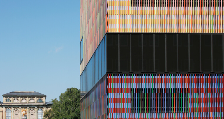
CFile is visiting some of the most impressive uses of ceramics in contemporary architecture over the the past few years. This week the selection includes the Museum Brandhorst that stands at the entrance of the arts district in Munich, Germany, offering a foretaste of the creativity beyond. The museum’s most striking feature is its facade, composed of 36,000 ceramic rods in an assortment of 23 custom colors.
Designed by Sauerbruch Hutton and manufactured by NBK Keramik GmbH, a Hunter Douglas company, the colorful facade was created both to connect and to enliven nearby structures. The architects placed the array of terracotta rods in front of colored, perforated aluminum sheeting to create a gentle veil on the outside of the structure. Sunlight shining on the facade casts a pattern of shadows that shifts throughout the day, further enhancing the design’s dynamic effect.
The architecture of the interiors – which house over 700 works of art – was designed to create ideal exhibition situations. The external facade, however, was conceived as an explicit demonstration of the role of the museum as a place for living art.
In that sense, the architects’ polychromatic design acts almost like a large-scale abstract painting. This skin plays with the perception of the scale and plasticity of the building. The overall building envelope is seemingly divided into three interlocking volumes through the demarcation of different color fields.
Seen from afar, each of these color families merges into one overall neutral color – each possessing a different degree of lightness and its own variation of hue. But when viewed close up, each of these fields is in turn composed of seven different colors.
“The biggest challenge for us is always applying the desired color to the correct material,” explains architect Louisa Hutton. She continues, “ultimately, we are dependent on the manufacturer’s eye…In the case of Brandhorst, we visited NBK on several occasions during the process.”
Perhaps not surprisingly, the technical design of NBK’s system is also dynamic, and uses the principles of a rainscreen, ventilated facade. Instead of being engineered as a relatively impervious layer, caulked and sealed against the weather, the facade features open vertical joints that allow free flow of air. The facade’s ability to balance air pressure, along with a support system that drains rainwater away from cavities behind, discourages water from entering wall cavities.
In a recent architectural review, Jonathan Glancey of The Guardian had architect Matthias Sauerbruch describe his inspiration for the building: “‘What we’ve tried to create,’ says Sauerbruch, ‘is a jewelry box that, hopefully, catches your eye and makes you want to see what’s inside. And when you get inside, the jewelry is the art – and not the architecture.'” Glancey’s own assessment is even more generous: “Sauerbruch is being too modest,” he says. “The Brandhorst Museum is a jewel of a building, one that will greatly bolster Munich’s growing cultural significance.”


 All photos © Hufton + Crow
Visit Museum Brandhorst
Visit NBK Keramik GmbH

Add your valued opinion to this post.