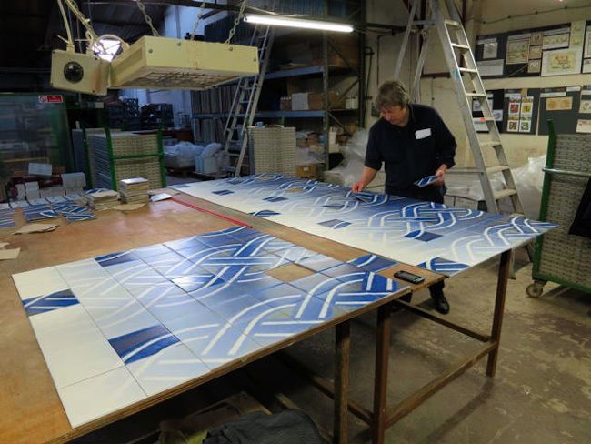
You may know Robert Dawson for his china plates that are imaginative riffs on the classic Willow pattern tableware design, which is the single most successful product in the history of ceramics. But it’s not his bread and butter, that comes from his large-scale installations of murals and building facades. Two more have been added to his list, both are in England, one in Croydon and the other in Liverpool. One was a perfect partnership and the other, Sedgemoor House, shown here, was not.
The Liverpool project devolved into problematic working conditions, proving unpredictable and sanity threatening. Dawson was asked by the Liverpool City Council to design and produce a work of art that would go on three outer walls at Sedgemoor, a new facility to house a dementia support centre. The three walls are at right angles to each other and they overlook an inner garden.
Dawson describes the beginning of the project thus:
(I was) looking in the Decorative Arts archive of the Walker Art Gallery in Liverpool for material to work with, but later decided to use three tile patterns from the Minton tiles in St Georges Hall, Liverpool. I reworked the tile patterns and set the tiles up so that parts of the patterns progressively go missing. This missing-out of parts of the patterns results in alternative new patterns emerging. A visual rhythm appears across the surfaces of the three walls, the three walls which are perpendicular to each other and surround the observer.
While Dawson’s tiles were produced without a hitch, other things went wrong. First, a lamp and an exposed pipe cropped up in the area designated for the artwork, meaning Dawson had to rethink part of the design on site, during the installation. Then, in an act of utter insensitivity to his art, a wooden structure appeared directly in front of his central blue and white wall, causing a visual obstruction contrary to what had been agreed to.
Though he did not realize it at the time, Dawson’s design had perhaps more relevance than he first thought. One city official praised him for creating a pattern that symbolized the dysfunction of memory that plagued the building’s clients. Dawson’s quote above “parts of the patterns progressively go missing'” pretty much describes dementia. Dawson was taken aback, “I hadn’t thought of my design as metaphor for dementia,” he maintains, but the official was right and the walls have a deeper beauty (intruding structures aside) and a heightened poignancy for it. Which calls attention to the fact that Dawson’s studio is called Aesthetic Sabotage, so one has to wonder…
Garth Clark is the Chief Editor of CFile.
Above image: Tiles in production for Robert Dawson’s facade for Sedgemoor House in Liverpool. Courtesy of the artist.


Robert Dawson, the first wall in blue and white tiles for Sedgemoor House, Liverpool.


Robert Dawson, the second wall for Sedgemoor House, Liverpool.


Robert Dawson, the third wall for Sedgemoor House, Liverpool.


The image above shows Robert Dawson’s ceramic walls nearing completion. On his next visit he found the structure shown in the following photograph (that was to be above the wall and reduced in size) that totally ruins the blue and white wall’s sight lines. All images courtesy of the artist.
See CFile’s post on Robert Dawson’s fascade, For Eloïse, in Croydon

Great beat ! I would like to apprentice even as you amend your site, how could i subscribe for a weblog website?
The account aided me a applicable deal. I had been tiny bit familiar of this your
broadcast provided shiny transparent concept
Obviously no joined-up thinking in the architect’s design team, then! What a pity – Robert’s work is beautiful as always.
Thanks for the feedback, Liz!