Big thanks to Peter Olson for allowing us to publish his outstanding new catalog Peter Olson: Photo Ceramica in cfile.campus. If you are a member, view the catalog in the library or begin your 30-day free trial.
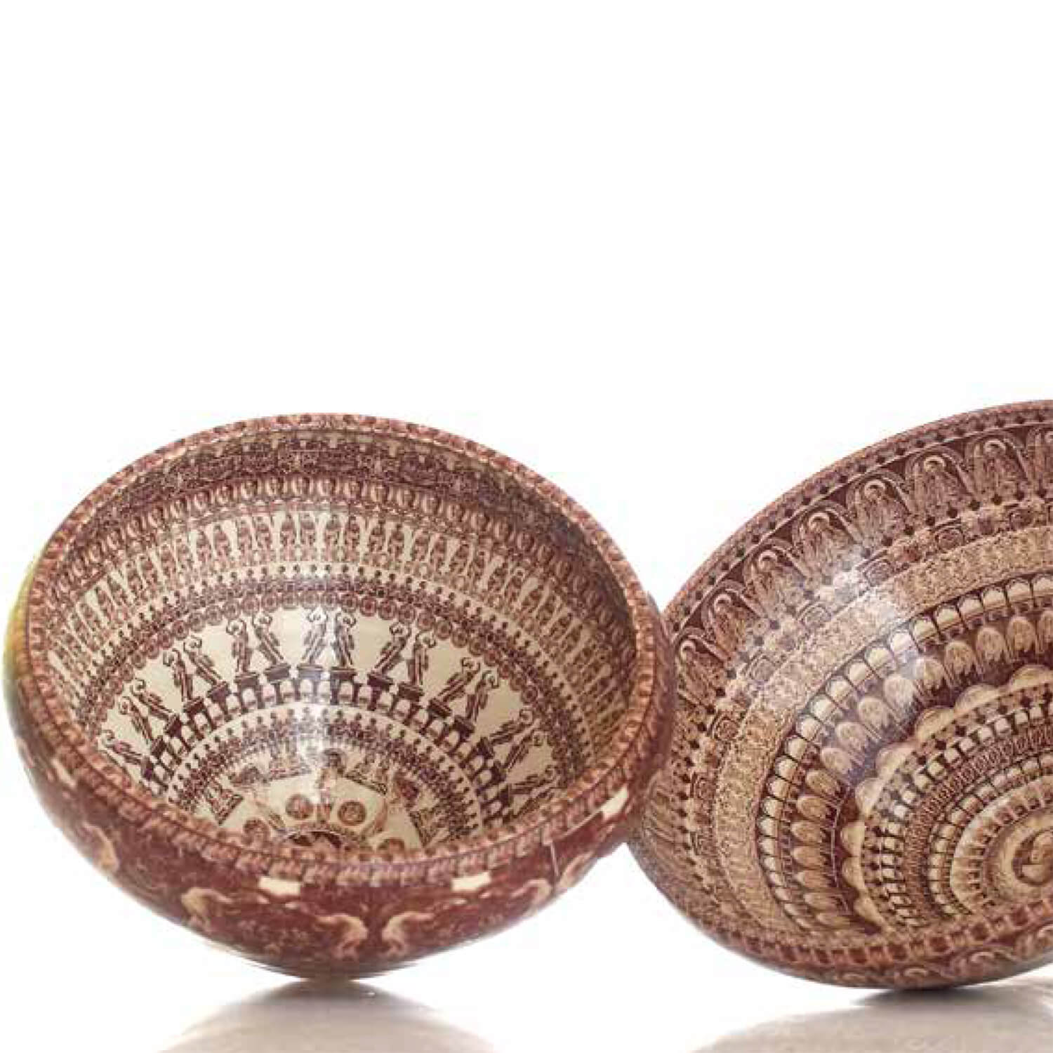
Featured Image: Peter Olson, Singles (left) Madonna #2 (right), 2017

Peter Olson: Photo Ceramica
Garth Clark and Jo Lauria
American Museum of Ceramic Art, 2017
28 Pages
Olsen’s ceramica harmonizes photography and ceramics, two mediums that have forced their way into fine art in recent history. As bands of imagery circle the thrown and assembled ceramic garnitures, there is a feeling that time is passing, history is revealing itself, a story is being told. The story itself is unclear. As catalog essayist Jo Lauria puts it, “[the garnitures] represent our material culture and present narratives of our shared humanity.”
Olson was originally trained as a photographer and had big commercial contracts with NASDAQ and Hershey, among others. So, it should come as no surprise that all of the photos on Olson’s ceramics are taken by him. Artisticly speaking, he is a street photographer, informed by daily life, the backs of people’s heads, and cultural and religious objects. Surprisingly, he has been working with clay for 6 years.

Peter Olson, New York Minarets, 2017, 14-20″
Lauria informs:
On any given ceramic, there may be as few as forty or as many as 900 photographic images.
In the design of the patterns, Olson works intuitively, starting with the center images and moving outward. But this is intuitiveness informed by education and experience. During the process of designing patterns, he is thinking about the serial images created by the nineteenth century English photographer, Eadweard Muybridge, who conducted photographic studies of motion. Olson attempts to apply the same dynamism in his collaged and repeated patterns as achieved by Muybridge’s photo studies so that the images seem animated and kinetic when viewed in the round on pots or in linear progression on tile murals. Olson also affirms that during the act of pattern creation he is listening to the words of Andy Warhol, who famously remarked, “If one is good, ten is better,” and this declaration guides Olson’s expansive approach to ornamentation.

Peter Olson, Philadelphia Democratic National Convention Jars, 2017

Peter Olson, Los Angeles Series, 2017
Lots of Olson’s pieces are site-specific. One in particular, New York City urn, each band portrays another aspect of The City. In this sense we are given a site specific, well-rounded (quite literally!) portrait of a place, featuring images of Subway tokens, Times Square, the GE building, Man leaving work. You cannot always make out these images exactly, but there is enough evidence to know that this is New York City! Along those lines, there is a Los Angeles series and Philadelphia series.
If you are a member, view the catalog in the library or begin your 30-day free trial.

Thank you Cfile for posting and for the opportunity to be included in your library, also Thanks to the best Designers ever Malish and Pagonis (http://malishpagonis.com)!
Minor quibble: unless Olson’s pieces are designed to installed in a particular location while they may be about specific sites they are not site specific. Love the work.