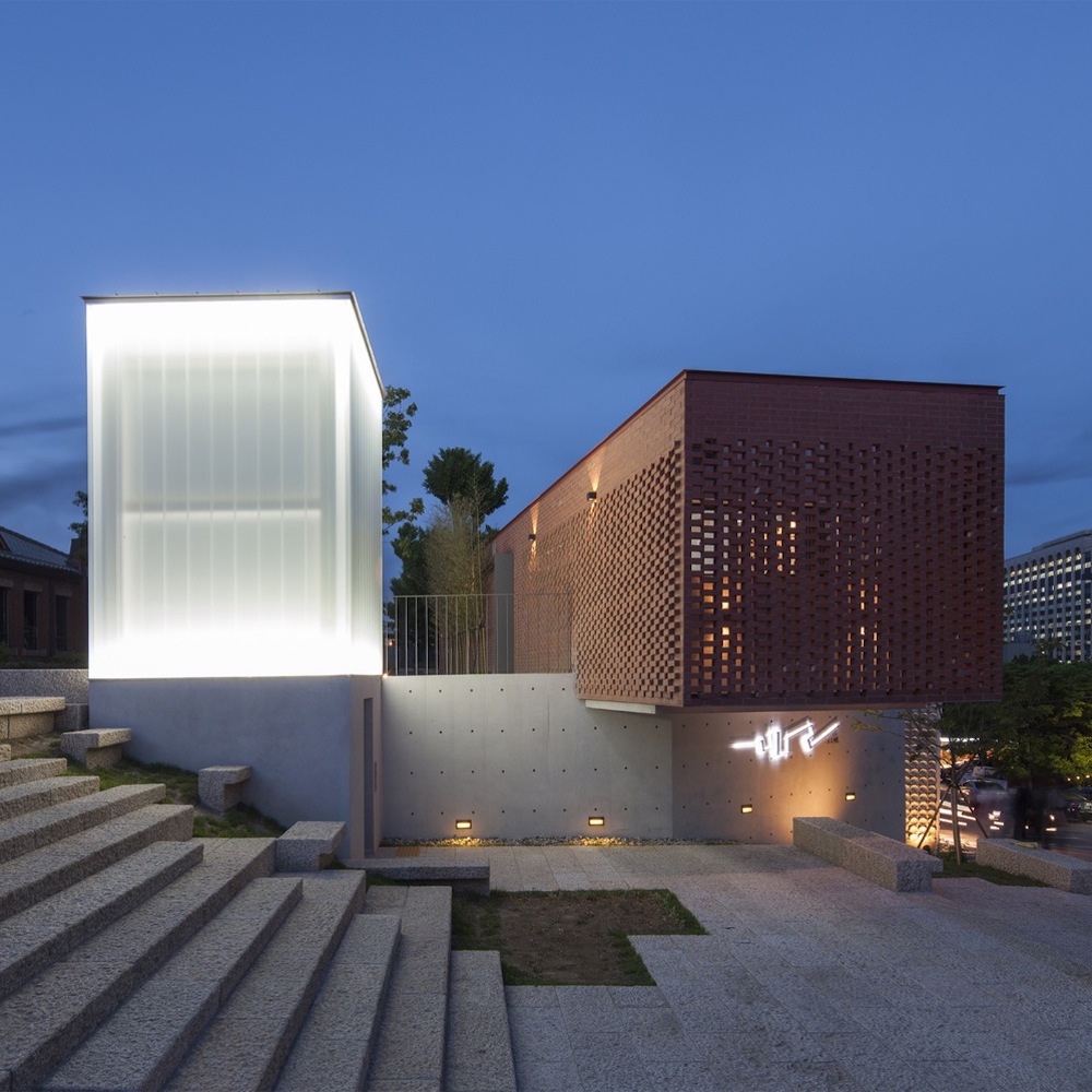
SEOUL — A multiuse building in Seoul, South Korea uses a brick volume to create a dramatic contrast against a semi-opaque, brightly-lit white volume.
The project, built by the Interkerd Architecture Firm, is a shared project between a public library and a tourism information center, the studio told Archdaily. The project was born out of necessity because the layout of streets in the neighborhood leaves both buildings with only one entrance. In elegantly solving this difficult problem, the firm also added a 4 meter tall wall to create a brick courtyard in which visitors can congregate.
The courtyard shows what the firm set out to achieve, even though the project was built on a necessary compromise with a cramped neighborhood. The two contrasting volumes form the facade of the street, drawing people’s attention to the buildings. The white volume, in particular, is an eye-grabber and for that reason is probably extremely useful within the context of a confined neighborhood. It looks like sanctuary even though there isn’t a sign in sight. It’s like a beacon, similar to how people in the UK used to hang lanterns from the chimneys of communal homes. In addition to the library and tourism center, the building also houses a public restroom. These little features add up.
We call attention to these details because, though they seem minor, they are a victory for economy and engineering. “Compromise” is often used as a pejorative, but there is still the opportunity to create something artful even while hampered by several less-than-ideal restrictions. Clever architects managed to squeeze blood from a stone (or brick) and created a space that is not only supremely useful, but attractive as well.
Bill Rodgers is the Managing Editor of cfile.daily.
Do you love or loathe this creation of contemporary brick architecture? Let us know in the comments.


I found this project wonderfully conceived and planned and I particularly like the use of the materials.