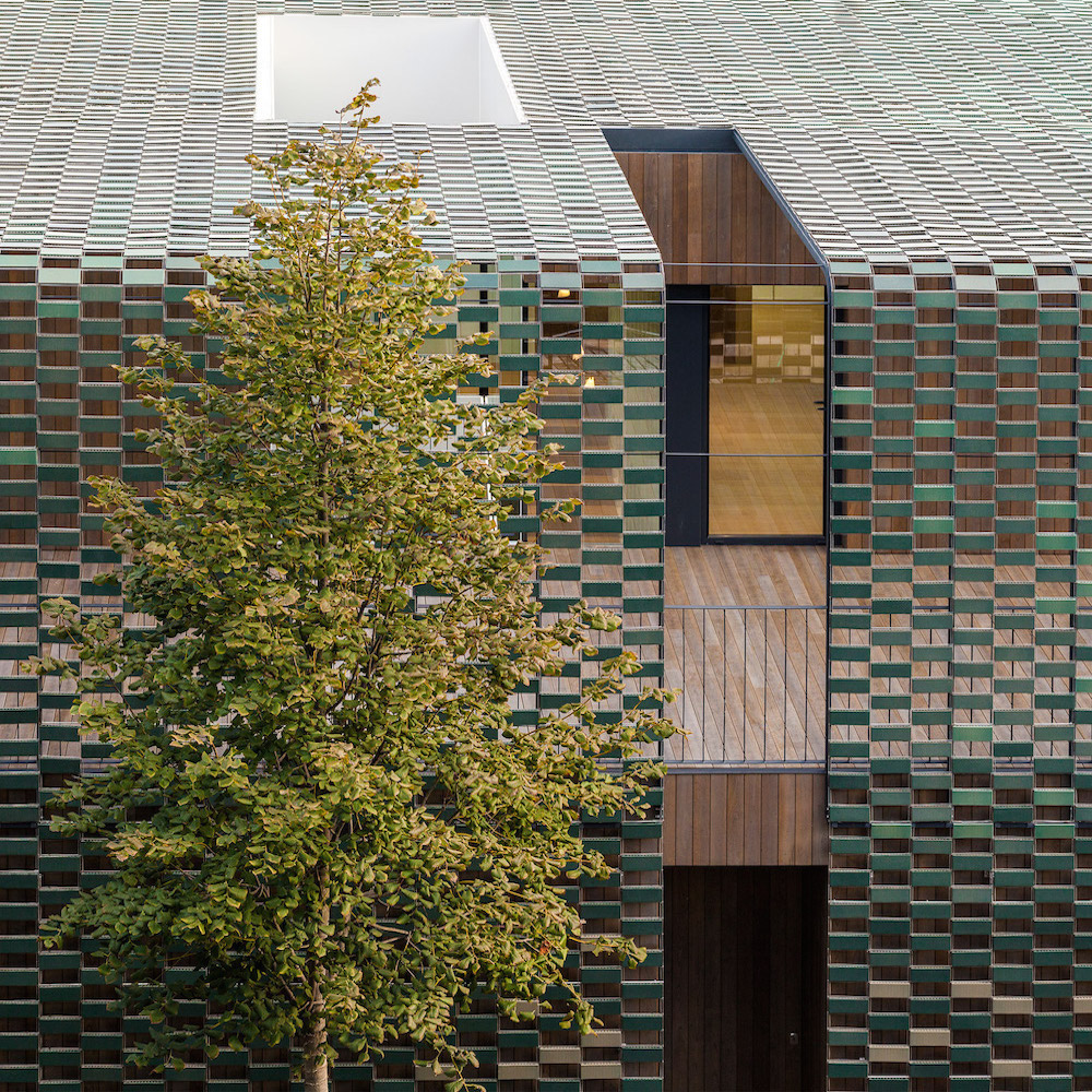
BARCELONA, Spain — Our second architecture post for this week features another ceramic tile screen. A home previously owned by the India consulate in Barcelona was recently renovated byt he PMMT architecture firm. A standout feature of the house is a ceramic privacy screen acting as an envelope. The tiles are colored to blend in with the surrounding trees.
Of the two projects we ran this week, I like the University’s the most. The screen around the university uses the screen for practical purposes— keeping the building energy efficient— but it does something else, too. University of Pau students see a building that looks like it’s in the process of being rendered, sending a message that the school is both a place of technology and a work in progress; it needs the input of the students to be complete.
I’m not looking to the residence for any inspiring messages, but there’s something I hate about this screen. It communicates something ugly, and as such I can’t see the tiles as an aesthetic choice. They may as well be a rusty gate wrapped with barbed wire, for all the humanity they evoke. I’ve seen electricity substations with more warmth to them.
I live in Santa Fe and the wealthy here go to all sorts of lengths to conceal themselves from the community they live in. A short drive through nearby Tesuque will acquaint you with walls and carefully-sculpted landscapes designed to hide everything. My “favorite” of these is the rough-hewn coyote fence that conceals an electronic gate you have to use a keypad to access. The owner of that one effects both the charm of rural New Mexico while also having his or her fortress. It looks quaint to the owner, no doubt, but to me it looks like a lie.
These choices are not garish because of the design. The intent behind them makes them fake, reveals their true purpose. Here is the home of someone who hates their neighbor so much they try to vanish before their very eyes. That intent could manifest in a fake coyote fence, this ridiculous green box, or a shimmering sci-fi forcefield and it would all read like antagonism. Don’t look at me. Don’t engage with me. I’m a member of this city, but only grudgingly. If I had my way it would be myself to the exclusion of anyone else.
Inside, it’s a slightly different story. If I lived within this house I would enjoy the way the light plays across the concealed porch, creating checkerboard shadows that move with the sun. As a neighbor, though, I couldn’t stomach waking up to this thing every morning.
Absent the antagonism this home signifies, why should you care about this? It’s thoughtless. It achieves nothing beyond its own shallow intent. It’s a fence, nothing more. We want designs that push the bounds of creativity. If Cfile has a theme it’s that ceramics, a material that’s been with us since the dawn of civilization, can achieve wonderful things we haven’t seen yet. Ceramics can be more than this. If it wants to maintain its place in the art, design and architecture worlds, it needs to be more than this.
Bill Rodgers is the Managing Editor of cfile.daily.
Do you love or loathe this work of contemporary ceramics? Let us know in the comments.


I love this, an aviary for humans.