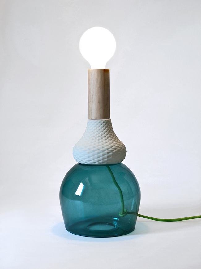
MILAN — We don’t have a problem with artists and designers referencing each other’s styles. It’s all part of a dialogue and only pedants enjoy being offended by it. It’s not our job to guard anyone’s turf.
That said, we think Milan designer Elena Salmistraro is reaching with a series of table lamps inspired by painter Giorgio Morandi. Rather than simply being a reference to Morandi, it’s as though the lamps are trying to raise their profile by being associated with him, which comes off as tacky. We’d let it slide, but the airs wafting off these things are so thick they set off the smoke alarm in our office. MRND (see?) is accompanied by some of the most hack PR designspeak we’ve read in months, the kind of cloying preciousness that begs you to notice its MFA.
“a current reinterpretation of his work declined through an emotional dialectic that wants to evoke the “Morandiana” atmosphere, in a union between art and design. The objects by Morandi that are most iconic belong to his still life, in particular the bottles made magical by the clever use of feeble colors and illuminated by a soft light. Elena Salmistraro, with a method that is almost surgical, extracts the object from the canvas that imprisons it, giving them back to 3D through a sort of a spell. Transforming the bottles in lamps, the enchanted light that Morandi used to give to his work becomes part of the object itself, the shadows – wisely used – become discordant materials, the ripples coming from the brush stroke of the master acquire a specific configuration converting themselves into a texture that has a contemporary flair. Also the colors get a new life, yet staying natural and soft, they look like they’re chasing a new position within our current perspective.”
I’ll rewrite that without the bloviating: MRND are lamps that reference Morandi’s bottles and jugs, but they’re in three dimensions rather than two and they use bright colors instead of the muted tones the painter is known for. They miss the point of Morandi, though. They lack the grace and dignity the painter gave to simple, everyday objects. We don’t doubt that someone can achieve that tone with bright, bold colors (in fact, that would be fantastic), but these lamps come across as trite. The glass, ceramic, and cord components clash with each other. They needed more time to develop.
What do you think of these works in contemporary ceramics? Let us know in the comments.


These are transformative works with words alone they somehow transform into tackier fixtures…
I think the work is well thought out and interesting. It’s display in these photographs is not my favorite though. The art would look more appealing in a certain type of home. Perhaps the bright colors may become muted under the certain light. Everything around the lamps speaks to modernity, but it references an old artist who was working with even older things.