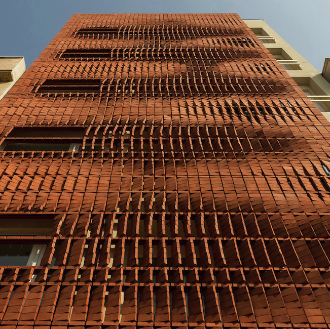
TEHRAN, IRAN — Lately we’ve noticed several architects bringing brick or tile screens to the front of their facades. This was the case with Cultural Center La Gota in Cáceres, Spain and the Saint Roch Car Park in Montpellier, France. Both used a structure called flexbrick, which allows the builder to arrange a screen of brick or tile across a wire grid. This gives the facade a semi-permeable look and has benefits to energy saving because the material is preventing the sun’s heat from reaching the inner facade.


A similar technique was recently employed by Admun Design and Construction Studio in Tehran, Iran. There was a very interesting reason behind the choice. The builders told ArchDaily that Tehran is experiencing a population boom and that the cost of land is very dear as a result. It’s cheaper to build up than to build out.

But this economic need clashes against cultural and religious practices in the region, mainly those which value privacy. A stack of high-rise apartments starts to erode the sense of space renters have come to expect and so the building would be extremely unattractive for reasons that don’t really have much to do with the actual aesthetic of the building. Enter: the screen. We don’t know if Admun used flexbrick in this case, but the look is very similar. A screen of bricks seem to levitate in the air, creating a buffer that protects the resident from prying eyes while at the same time giving the resident a partial view of the outside. As an added bonus, the screen creates its own unique light and color effects. There’s an implicit sense of movement in the bricks’ arrangement. The builders state:
Brick has this unique potential to create a dynamic facade while using merely a single material. The architecture is constantly alive, from both inside and outside. The facade’s colorful texture changes during the day representing different qualities of light and shadow as the inner spaces experience the same.

Note the pictures that show light streaming through the screen. This light creates fascinating patterns on the wall. We also dig the way the screen takes on a copper tone at certain times of the day.
Do you love or loathe this contemporary brick architecture? Let us know in the comments.


Click to see a larger image.

Photographs by Mostafa Karbasi and Parham Taghioff, courtesy of the architects.


It’s pretty amazing how beautiful something so simple can be.
I don’t think the bricks were simply arranged just to look nice in photos, and it does give the feeling of movement, like it could be constantly changing through out the day.
I don’t know how I would feel living in the building though.
It seems a bit restrictive and confined.
Really love any idea that potentially changes a plain facade for the better.
But it seems that bricks were artfully ‘arranged’ for photos so that they spiral and undulate
gracefully. Perhaps a more chaotic arrangement wouldn’t be bad either but I’d like to see it.