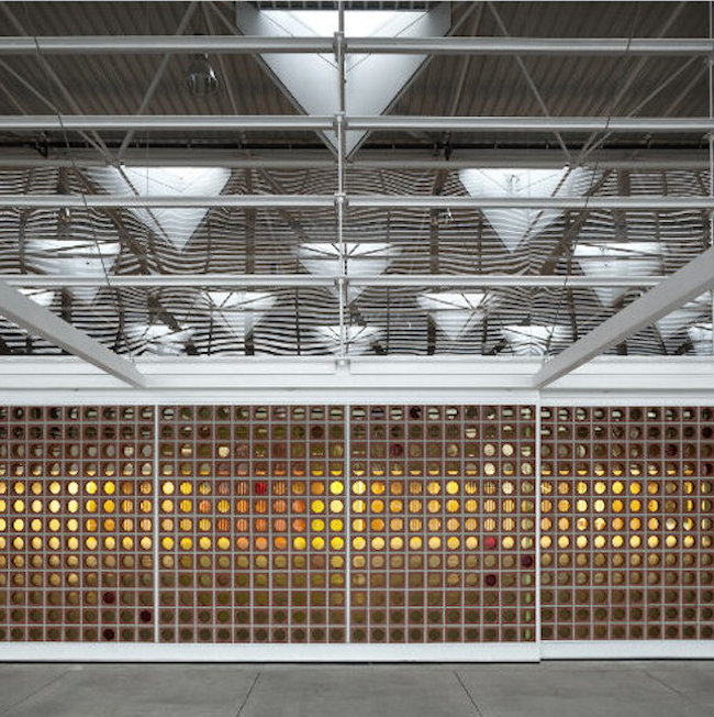
Castellón, Spain — Winners for last year’s Tile of Spain Awards included a teaching hall at a school in Valencia and a cocktail bar that takes on the look of fish scales.
The industry awards, held at the end of 2015, have two main categories: Architecture and Interior Design. Each category has a winner and a runner-up.

Multipurpose teaching hall at Gavina School. PHotograph by Mariela Pollonio. Click to see a larger image.


The winner in ToS’s Architecture category was the Multipurpose Teaching Hall at Gavina School in Picanya, Valencia. Architects on the project were Carmen Martínez Gregori, Carmel Gradolí Martínez and Arturo Sanz Martínez. A panel of judges chaired by architect Victor López Cotelo focused on the building’s simplicity and effectiveness, stating that the ceramic tiles used in the work resolve acoustic and light control problems. It also creates a visual connection between the interior space and its surroundings.
The runner-up in the architecture category went to Saint Roch Car Park in Montpellier, France by Archikubik. Their multifunctional building uses a screen of ceramic tile, which the judges praised for its sense of unity, even though the building exists for a variety of uses. The systematic tile screen acts as a visual filter and a filter for sunlight. The building appears to utilize flexbrick tile, which we profiled here in this earlier post.

The Blue Wave Cocktail Bar took top honors in the interior design category. The bar was built in Barcelona by El Equipo Creativo. The bar is a suggestion of a theme without belaboring it. Tiles that look like fish scales complement the serene blues along the walls and ceiling. Natural lighting plays across these, looking like sunlight skimming across the surface of the water. The judges said that the technical and functional qualities of the tile used create an appropriately festive atmosphere.
El Equipo Creativo took one of the two runner-up awards in the competition with Disfrutar Restaurant in Barcelona. We actually profiled this building about a year ago. The designers explained that they used ceramics in the project to communicate feelings of naturalness, humility and respect for the history of the Mediterranean. The ceramics sit alongside brick for an arresting effect. Click here to see more from that work.

L’Àtic Vernacle by El Fabricante de Espheras. Photograph by Milena Villalba. Click to see a larger image.
The second runner-up for interior design was L’Àtic Vernacle by El Fabricante de Espheras. The project was a penthouse in Valencia and the judges credited it for its simple and austere approach to making a “delightful living space.” While many of the projects on this list use tile on the ceiling and the walls, the penthouse changes things up by carpeting tile across the floor.
Do you love or loathe these honorees from the world of contemporary ceramics? Let us know in the comments. Also: click here to read a trend piece about tile that may tell you what you suspected all along.


Add your valued opinion to this post.