SINGAPORE – The website for Bureau design studio comes on a little strong, with partners boldly proclaiming that they’d be willing to get tattoos of the logos they design, an extended metaphor comparing design work to a scrotum and two separate instances where they mention that they have a gun rack in their office for the purposes of intimidating people.
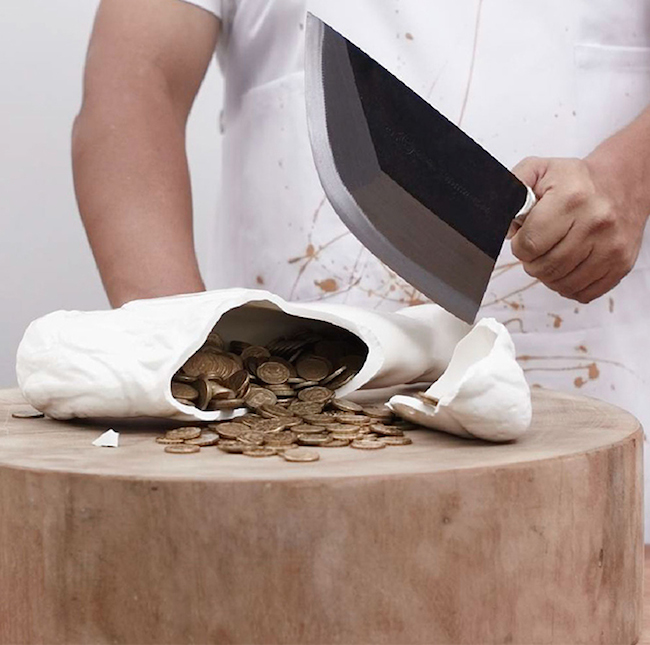
Given their bravado, their spin on the piggy bank makes a lot of sense. “Pyggy Bank” is a bank cast from the severed haunch of a pig. The project was done in collaboration with FARM for MADE FOR SAM.
The design takes its name from “pygg,” the orange clay that people in the middle ages turned into jars used to store money. Over time those jars turned into actual representations of pigs. Typically those banks are cartoonish, simple rounded representations of the animal. Perhaps because of their simplicity we think of piggy banks as objects for children. They’re an easy-to-grasp lesson about the importance of saving money.
Bureau changes that by carrying the representation of the pig to a cast of the real thing, then drawing a bright red circle around that representation by limiting it to a severed chunk of the pig’s body. You can even see a piece of bone sticking out of the meat. The studio said they experimented with several pieces of pig before settling on the haunch.
The funny thing is, even though this choice removes the piggy bank from a child’s bedroom it still comes off as childish. It’s a paradox similar to a lot of media with “mature” ratings: the excessive gore absent anything else wouldn’t appeal to someone older than 17.
I’m pretty sure this is entirely the fault of how Bureau chose to present the bank. It’s surrounded by ridiculous posturing by its designers. The images show a haunch sitting in a dirty Coleman cooler and a guy in a bloody butcher’s apron smashing the bank open with a large knife. It’s as though the photographer was on loan from Fangoria. It’s too much and, instead of it coming across as artfully shocking or at least fun, it plays as though the designers are trying too hard.
So: how can you take the concept of a piggy bank and be confrontational with it? Two works come to mind. Marcel Wanders The Killing of the Piggy Bank uses Delft blue porcelain and golden decorations to give the piggy bank’s final moments more weight, even dread as the hammer comes down (as it must for every piggy bank). Marie Moerel’s Food on the Table experimented with casts of animal viscera. It’s a shocking set, but not only because of gore. Moerel intrudes on the safety of your dining room table to show you the cold, hard reality of your meal. You realize that the gore isn’t an abstraction, something that was left behind at the farm. No, the gore is palpable presence in your life and you’re making it a part of you every time you eat. These two pieces take a crucial second step that is missing from Pyggy Bank.
Bill Rodgers is the Managing Editor at cfile.daily.
Do you love or loathe these contemporary ceramics? Let us know in the comments.


Add your valued opinion to this post.