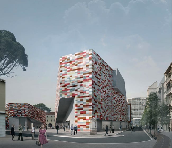
This is the first of three posts about the M9 museum’s architectural competition for its building in Venice Mestre (on the mainland opposite Venice). We thought it would be a good opportunity to invite some reader participation. Parts two and three are in this week’s issue.
Although the competition for this new building is over and was won by Sauerbruch + Hutton, whose building will be completed later this year, we at CFile wondered what you thought of the choices. In the following two posts we feature two other (losing) entries that also deal with ceramics. Each entry has its virtues and drawbacks. We are inviting you to go to the comment sections of these posts and tell us which selection you would have made, had you been on the jury. In a month we will tally the votes and see which building CFile readers would have chosen. Here’s our first contender:
Sauerbruch + Hutton have a history of working with innovative and colorful ceramic facades. One of our first posts featured their stunning Brandhorst Musuem in Munich. The M9 has a similar modular feel and color courage. Its goes against the grain of Venice architecture in that it makes no attempt whatsoever to blend with older extant buildings. Some might find this (as does architect and fellow entrant David Chipperfield) to be too intrusive, but the counter-argument is that the Venice island is already a living museum, so maybe Venice Mestre could do with a burst of contemporary vigor.
Further pictures of the design are below. Please let us know what you think of the buildings in the comments.
Garth Clark is the Chief Editor of CFile.
Above image: Sauerbruch + Hutton’s winning design for the M9 museum’s architecture competition.


Sauerbruch + Hutton’s winning design for the M9 museum’s architecture competition.

Add your valued opinion to this post.