BERLIN, Germany — Brandt + Simon Architekten’s said their 2009 family townhouse in Berlin is atypical of the neighborhood, but it does fit in with the surrounding plants and trees at the end of the row.
We guess it’s as though the house identifies more with the outside.
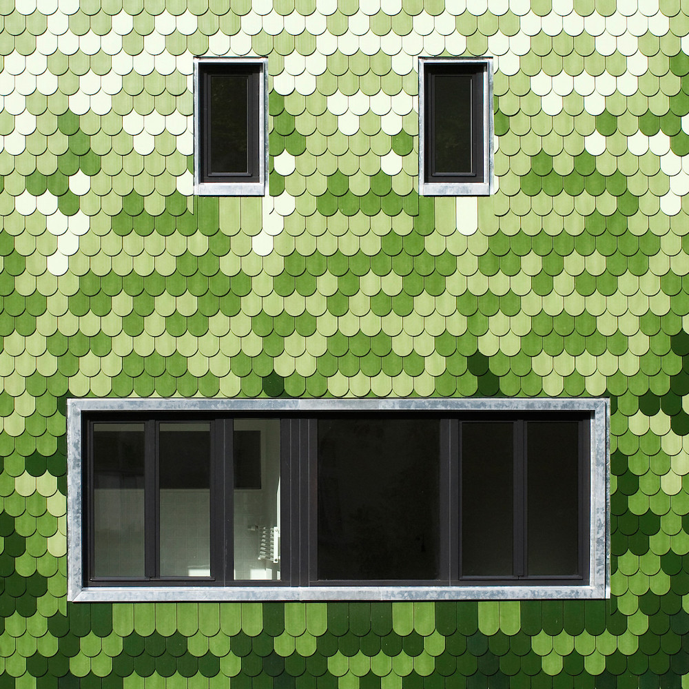
The most striking feature of the home is its gradient of green tiles, looking like brightly-colored pixelated ivy crawling up the facade. From a different vantage point, the home will sink into the natural landscape between the houses. The architects state that this is a throwback to the lot’s past as a plant nursery:
The untypical facade of coloured plain tiles make this house a peculiar new member of the urban fabric. Simultaneously the hasty passerby will not necessarily take notice of the greenish structure blending with plants and trees deep in the gap between neighboring buildings.
The huge number of plain tiles and the chosen range of colour lead to an interplay between the very traditional building material in its almost handmade haptic quality and the pixel-like appearance of the whole facade from a distance. The colour gradient is laid out as a repeating pattern and is planed into great detail. It recalls the former nursery on the estate and also interprets the clients brief to build a “garden house.”
Aside from being a nice way to cap off a row of nearly-identical white buildings, we like the house for how it approximates the natural world but falls quite short. Not only are they clearly geometric tiles, they also come across as digital, the kind of graphics you’d see displayed on an old 256-color CRT monitor. The divide helps in this case because one can sense the design reaching from the unnatural world to the natural world. Because the disconnect is so pronounced, one can appreciate how much success the house has made in its imperfect impression.
Bill Rodgers is the Managing Editor of cfile.daily.
Do you love or loathe this use of contemporary ceramic art? Let us know in the comments.


Add your valued opinion to this post.